How to build tubular type
Did you clock that Apple’s M3 Pro wallpaper had “PRO” hidden in it? It’s hard to read, but hat’s the point. It’s supposed to be decorative first and tubular typography in style. There are loads of ways to build tubular typography, continuous, modular, structured, chaotic.
☝️ Modular: Grid gang.This one’s all about structure. Think uniform stroke weight. Clean segments. Everything locked into a tight grid. One of my favourite foundries @typo72typo prioritise uniform stroke weight to design modular, segmented type with strokes super consistent and build letters like they’re engineered. I used a 7×7 grid to design a “5G” ambigram with sharp angular cuts, controlled and intentional. It feels almost architectural.
✌️ Monolinear: Continuous flow.Apple’s “PRO” isn’t strictly grid-based, but it’s geometric and monolinear. It looks like it was bent from a single piece of wire, even spacing, balanced counters. Just one continuous stroke doing its thing, like industrial tubing in dark bevel material. Sexy and clean.
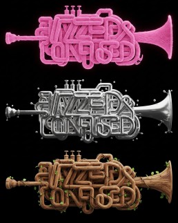
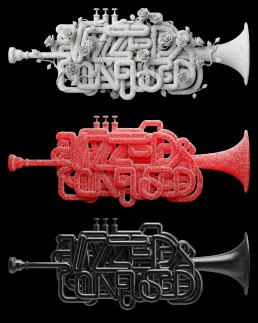
👌 Free flow: Single wire.I did a trumpet piece outlining “Jazzed & Confused” with one consistent stroke and rounded corners. No strict grid or heavy system, just angles. It’s probably the least intimidating approach because you can literally find your own type style and rhythm. The only real challenge is legibility.
Anyway enjoy and let me know what other tubular styles am I missing?
1:29
Additional visuals