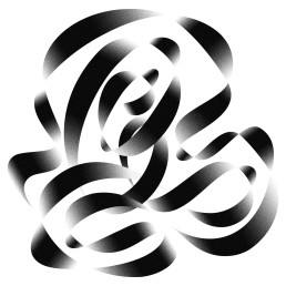
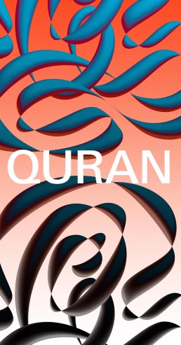
Custom lettering pt.7: Pushing script ‘Q’
How to push a boring design to bling. Most of the time, I find myself stuck with the software defaults. Even though I’m using a Wacom instead of a mouse, which does help with a smoother flow when I’m designing script lettering, I’m still not quite happy with how it turns out.
Just when you reckon you’ve nailed the perfect letter shape with the best flow and the brush you’ve got, it goes stale in about five minutes. The problem’s usually a mix of the tools and your trained eye — sometimes it just needs a bit more.
That’s the moment when you’ve got to push it. “How?” you might ask. In this case, I’ll take the bits of the letter I’m really not feeling, and just push them further, see where it goes.
The result? A fresh, interesting letter with a bit of sexy shape to it.
1:15
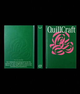
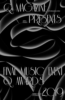
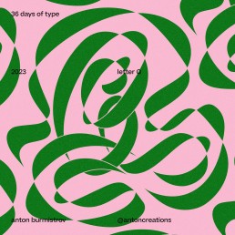
Additional visuals