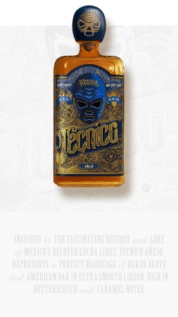
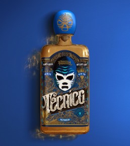
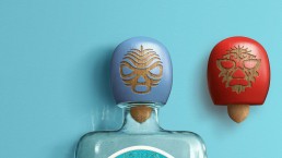
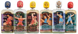
Tequilas Rudo and Tecnico are inspired by Lucha Libre, an extremely popular Mexican style of professional wrestling, and its rich cultural tradition. All Lucha matches are based on the eternal battle between forces of good and evil, represented by two groups of wrestlers: Tecnicos, noble fighters and heroes, and the famous villains of the sport, brawlers and rule-breakers, Rudos.
Comic book-style illustrations are confusing for the consumer and make the product look “cheap” and gimmicky. Each age expression within the brand features different wrestlers’ figures, cluttering the brand message. There are too many colours involved and intermingled between the two products, which make it difficult for people to distinguish between the Rudo and Tecnico brands. The paper used for the labels is thin, metallic and does not highlight the artisanal origins of the products.
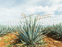
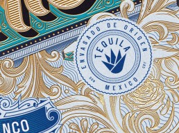
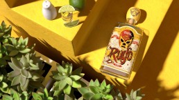
Design a label to highlight the artisanal roots and premium quality of the tequila, to help connect with a larger customer base, through the new packaging design.
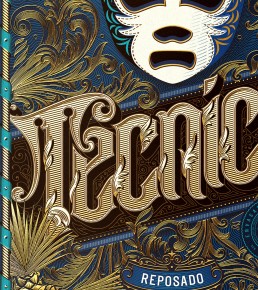
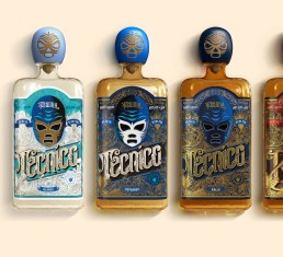
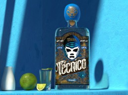
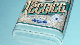
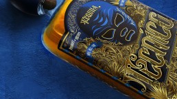
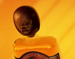
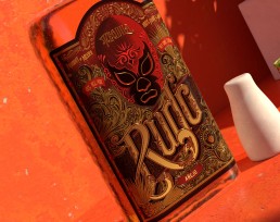
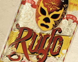
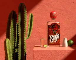
The essence of Lucha is in its cool, edgy and mysterious style. The Lucha mask is the main visual anchor, surrounded by the elements that underscore the fascinating cultural tradition.
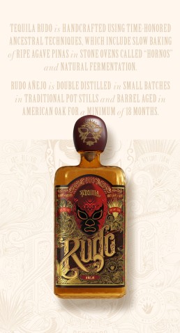
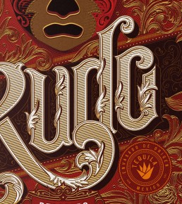
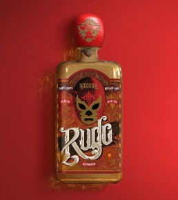
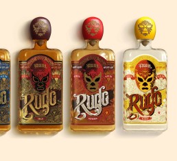
The design of Rudo and Tecnico tequilas is based on the intricate masks worn by Lucha Libre wrestlers. The mask is a centre piece of the label design surrounded by typography and flourishes. I’ve developed the concept and designed the label entirely.
Client
Double Eagle Imports
Brand
Rudo and Tecnico
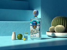
3d visuals
Service
Lettering, Packaging
Featured
Designboom, Dieline, Packaging of the World, World Brand Design, Creative Boom, Victorian Type, Abduzeedo