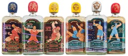
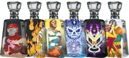
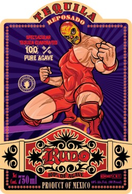
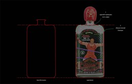
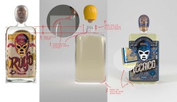
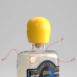
Problem. Comic book-styled illustrations are confusing for the consumers and make the product look “cheap” and gimmicky. Each age expression within the brand features different wrestlers figures, which clutters the brand message. There are too many colors involved and intermingled between two products, which make it difficult for people to distinguish between Rudo and Tecnico brands. The paper used for the labels is thin, metallic and does not highlight the artisanal origins of the products.
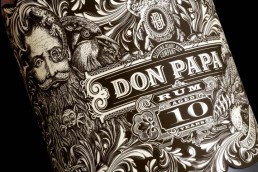
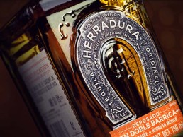
Objective. Design a label to highlight the artisanal roots and premium quality of tequila that will help to connect with larger customer base through the new packaging design.
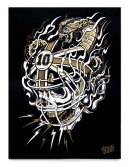
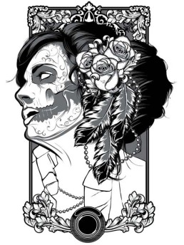
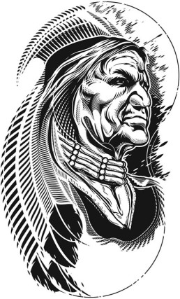
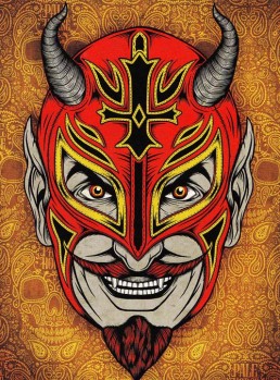
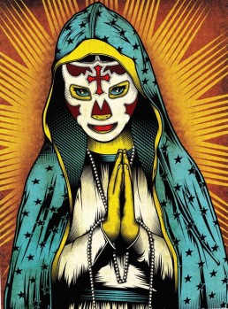
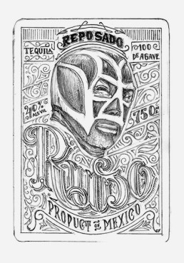
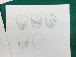
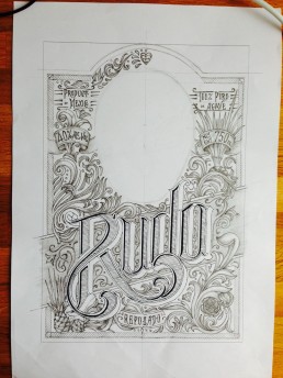
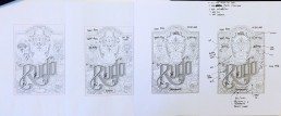
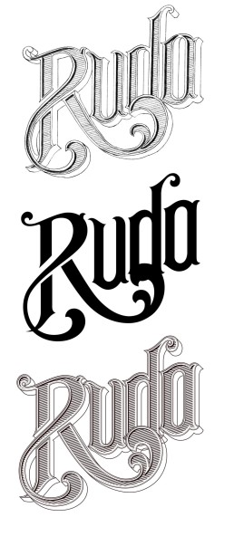
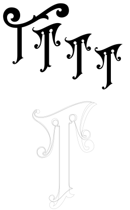
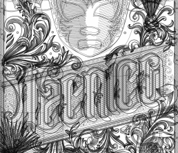
Searching for a potential stylistic execution
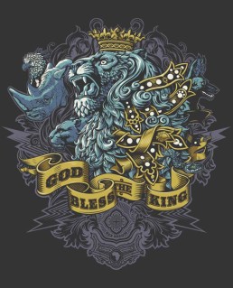
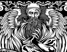
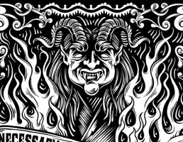
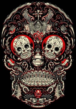
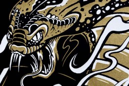
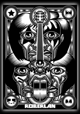
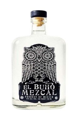
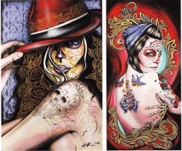
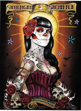
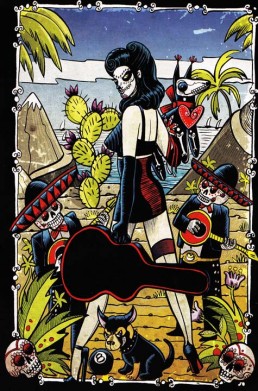
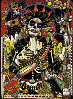
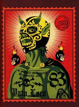
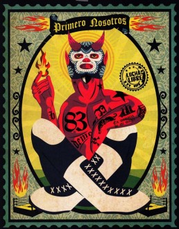
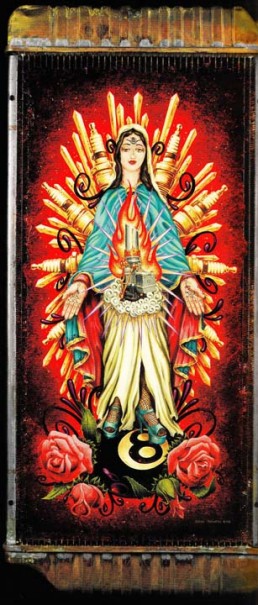
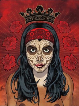
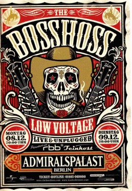
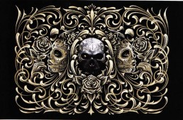
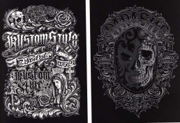
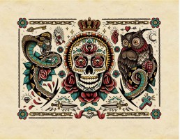
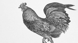
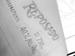
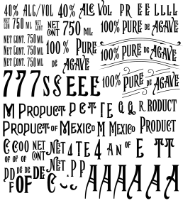
Client is feeding the label print references
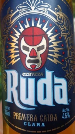
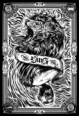
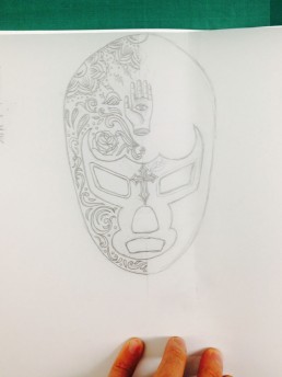
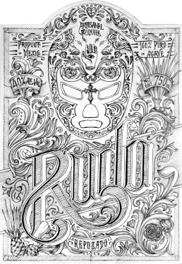
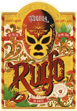
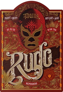
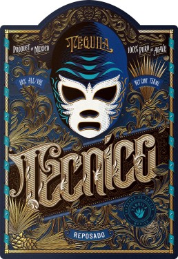
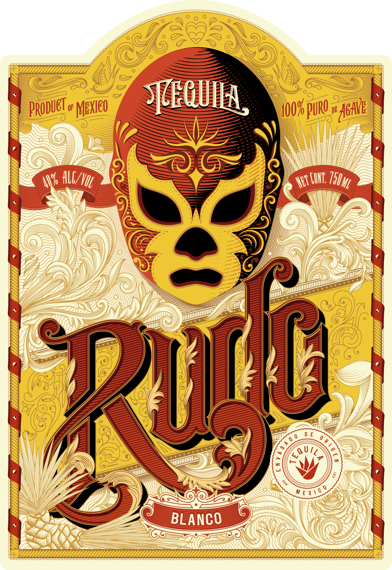
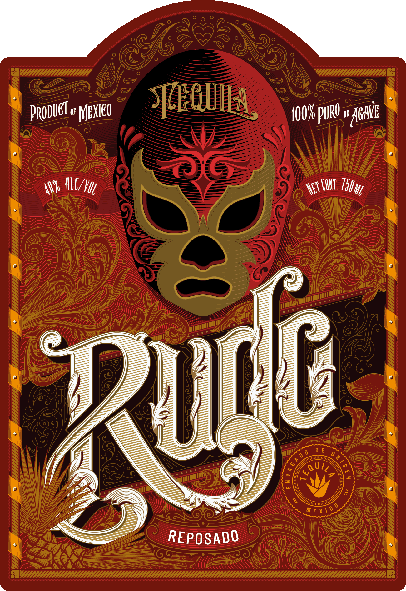
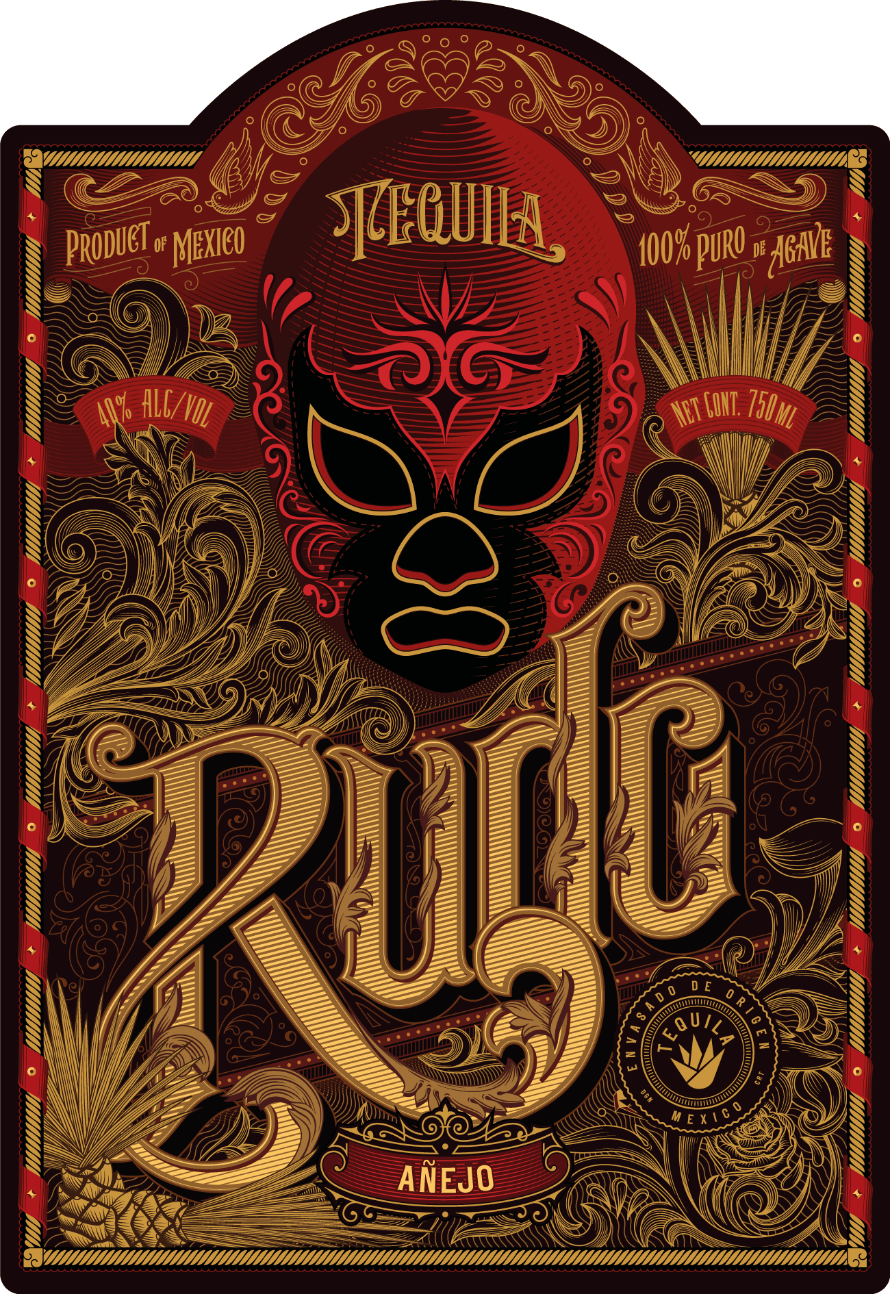
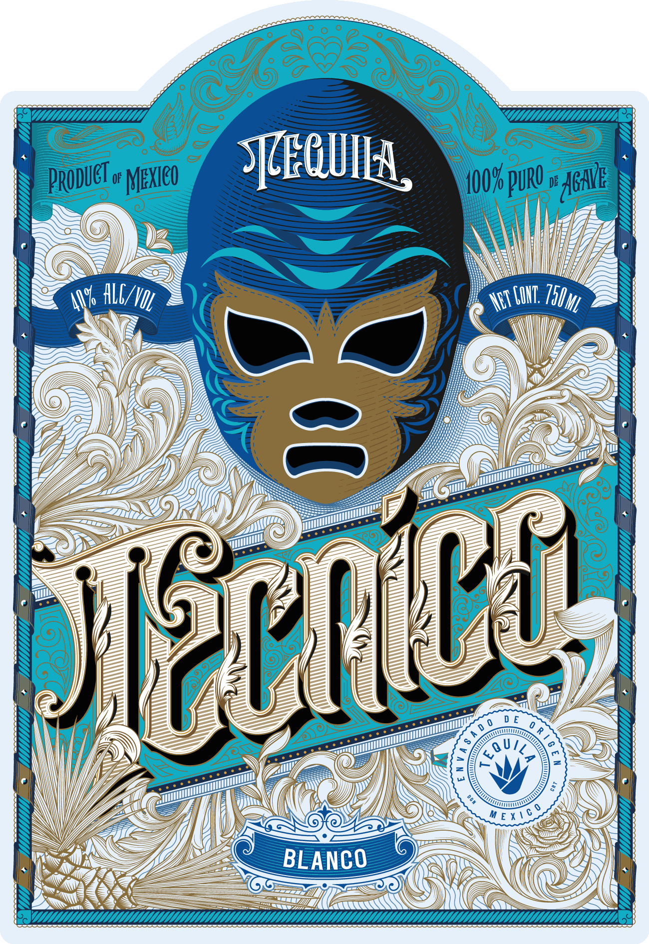
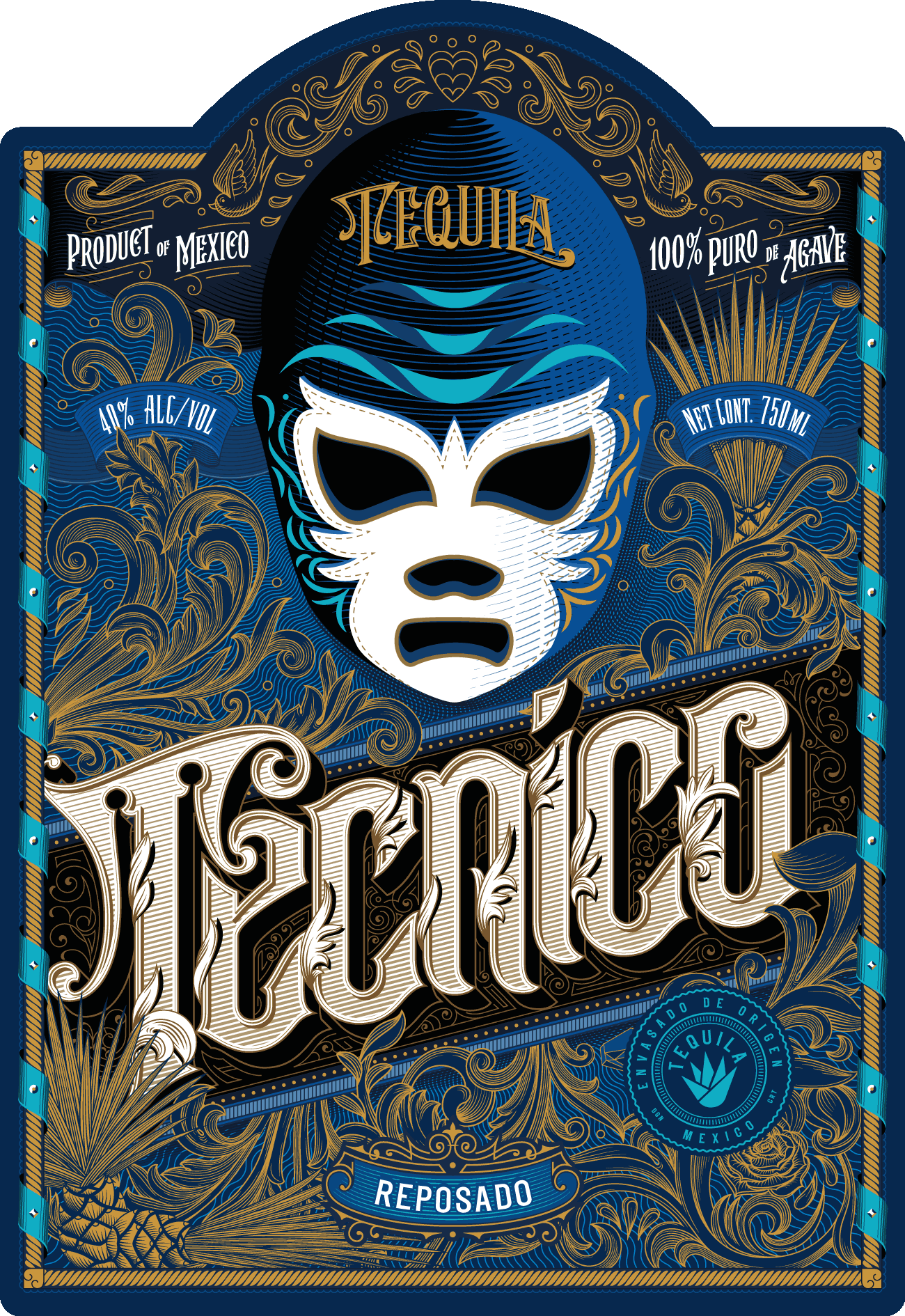
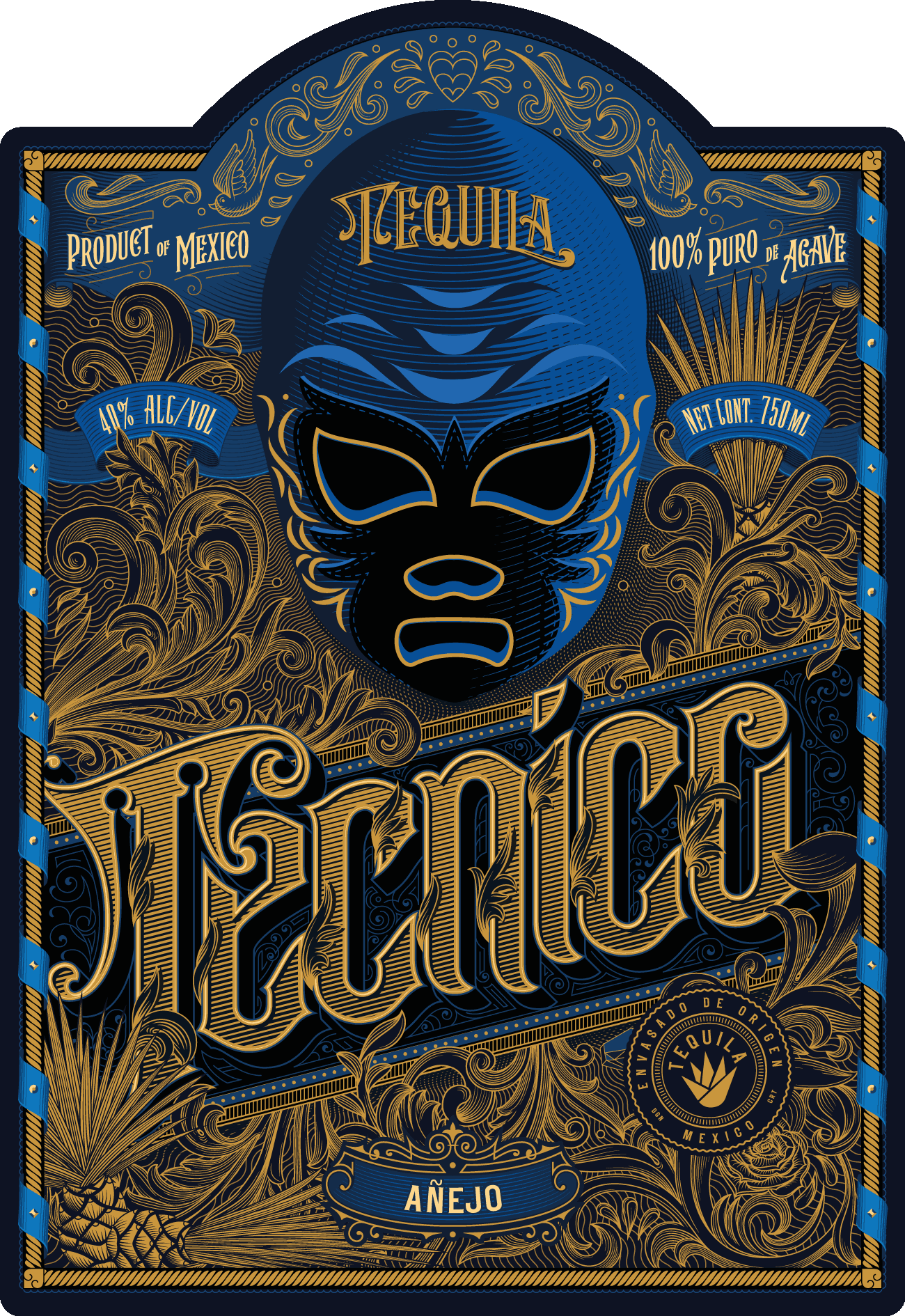
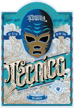
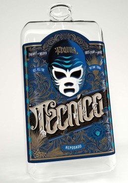
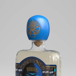
Solution. The essence of Lucha is in its cool, edgy and mysterious style. The Lucha mask is the main visual anchor surrounded by the elements that underline the fascinating cultural tradition.
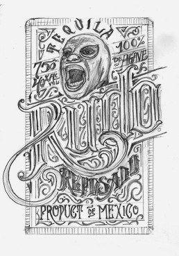
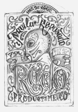

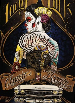
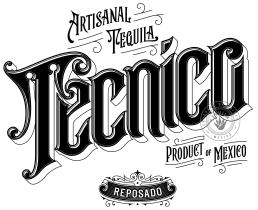
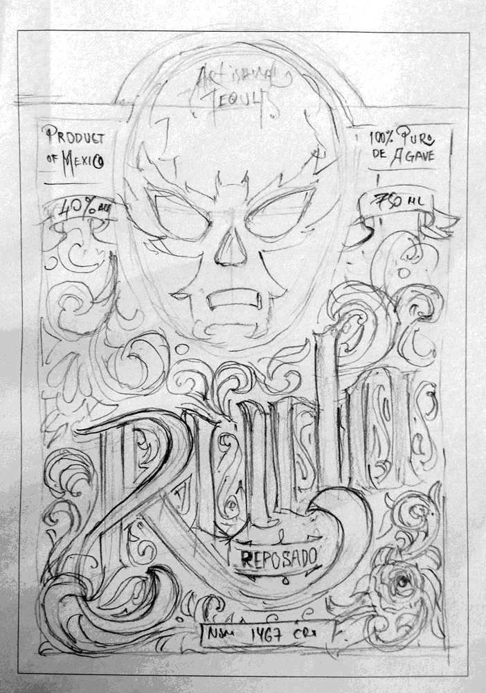
Client chooses sketch no. 4 and it is going to the development
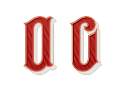
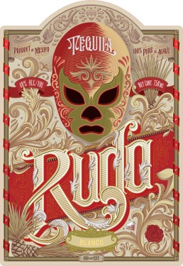
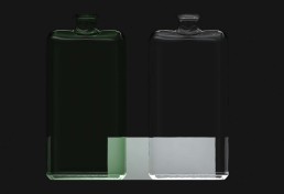
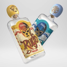
Rudo Blanco colour choice
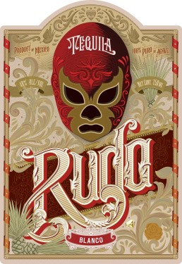
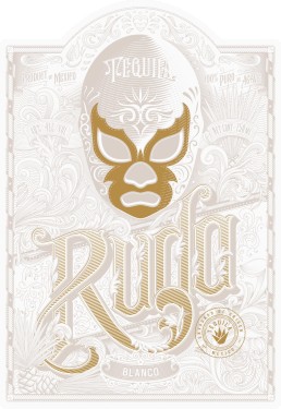
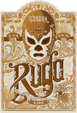
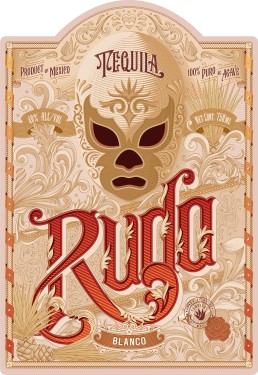
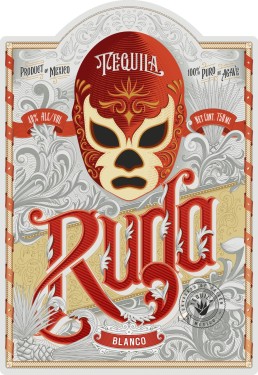
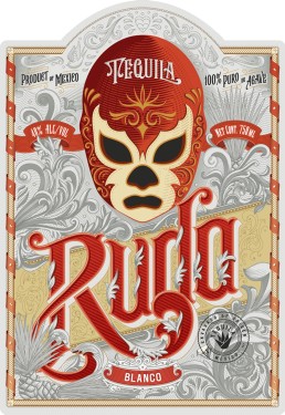
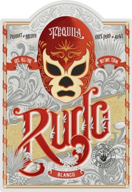
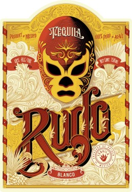
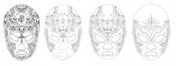
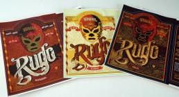
Shortlisted colour versions for Rudo label
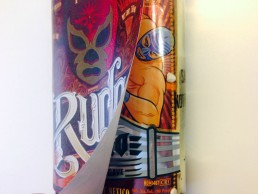
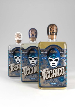
Before and after
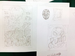
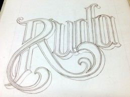
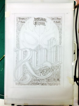
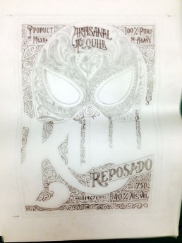
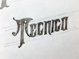
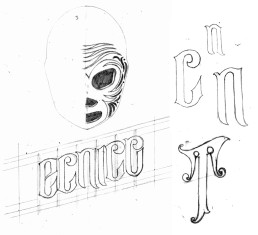
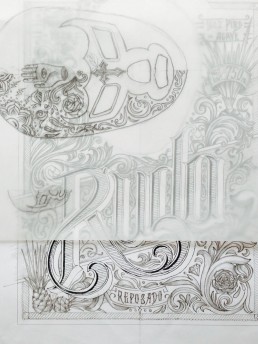
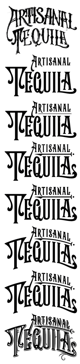
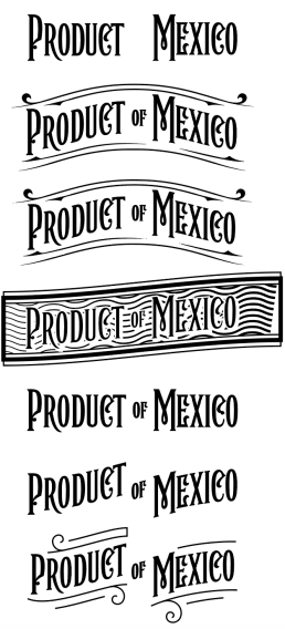
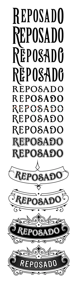
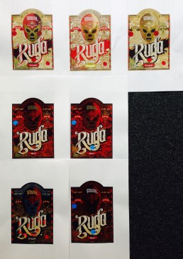
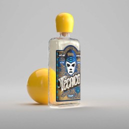
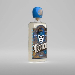
Design progression
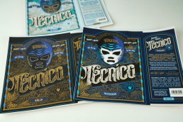
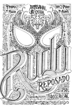
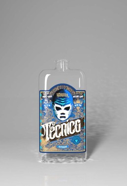
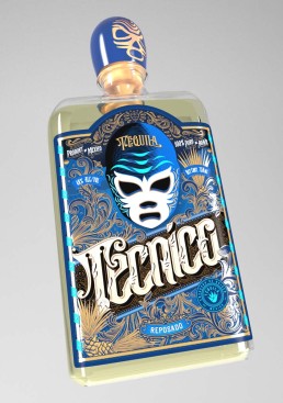
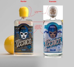
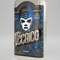
Final and approved label designs
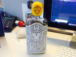
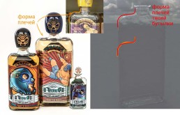
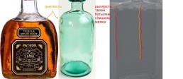
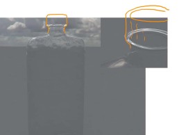
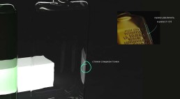
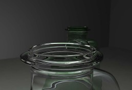
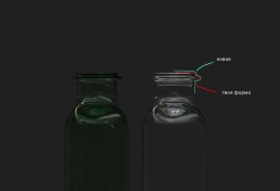
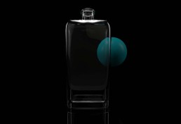
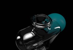
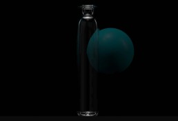
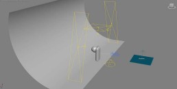
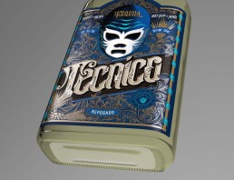
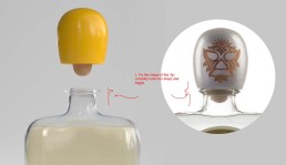
Working with 3d designer on creating the bottle
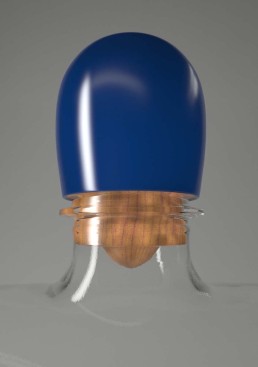
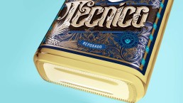
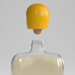
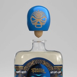
Done!