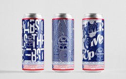
To celebrate the 10th Art Can Contest, Pabst Blue Ribbon invited creatives from around the world to create brand-inspired, two-toned can designs.
In contests like this, the briefs can be quite open to let the creative mind roam free, and the final art can be anything. I knew there would be a lot of illustrators after the $10K, with talent that I couldn’t compete with. So I decided to team up with good comrade of mine and place a bet on typographic designs. After all, two minds are better than one and we needed to pick a strategy that would help us stand out from the noise of all the illustrative entries.
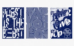
We created three different concepts for the contest: 1. Wordplay 2. Optical illusion 3. Motivational slogan.
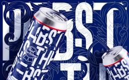
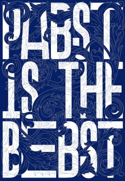
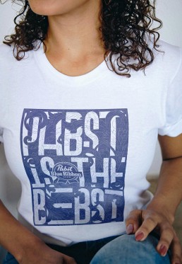
Going against the grain of the majority of entries and previous winners, ‘Pabst is the Bebst’ is a type-led design that aims to show how Pabst beer has stood the test of time. This is portrayed through the contrast of old and new, traditional flourishes intertwined with modern typography.
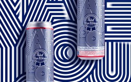
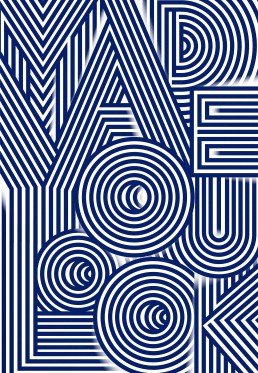
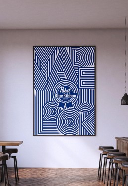
I did though, didn’t I? Made you look is a bold and eye-catching design, created for stand-out amongst the sea of entries. Ribbon-like details create an optical-illusion with type. The phrase brings character and a voice to the can, enticing a wry smile from those about to pick it up.
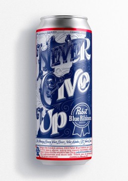
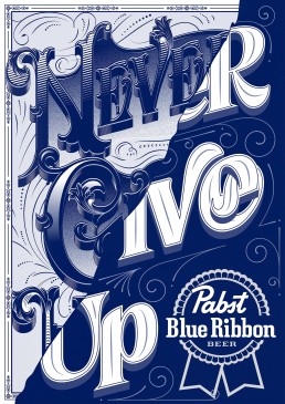
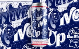
A phrase to tell yourself at the hardest times; a call to arms for all Pabst drinkers. The design itself shows a blend of old and new typographic styles, showing that if you never give up, just like Pabst Blue Ribbon, you’ll adapt and grow stronger.
Project
Talenthouse
Art Direction
Liam Nicholson
Outcome
Illustration, Lettering, Packaging