

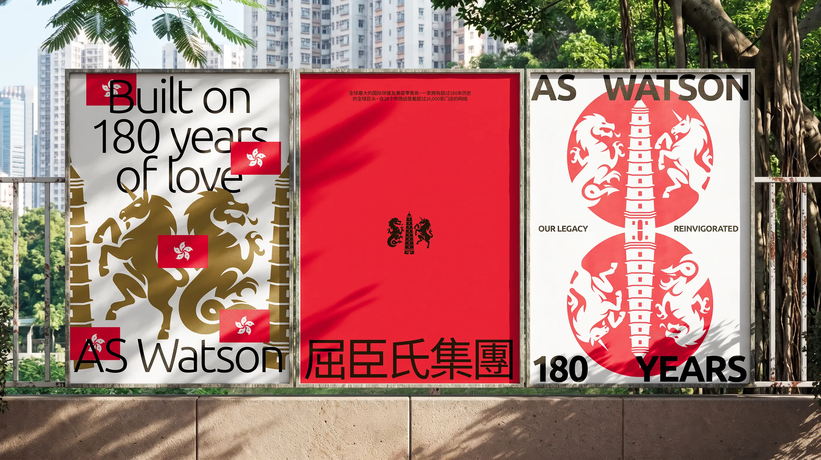
I got the shout to collaborate with the team at WHAM to modernise the identity for AS Watson, the world’s largest international health and beauty retailer. When a brand has been around since 1828, it’s not “just a small update”, it’s designing under 180 years of pressure (eek). We kept the heritage, killed the clutter, and built something ready for the next century.
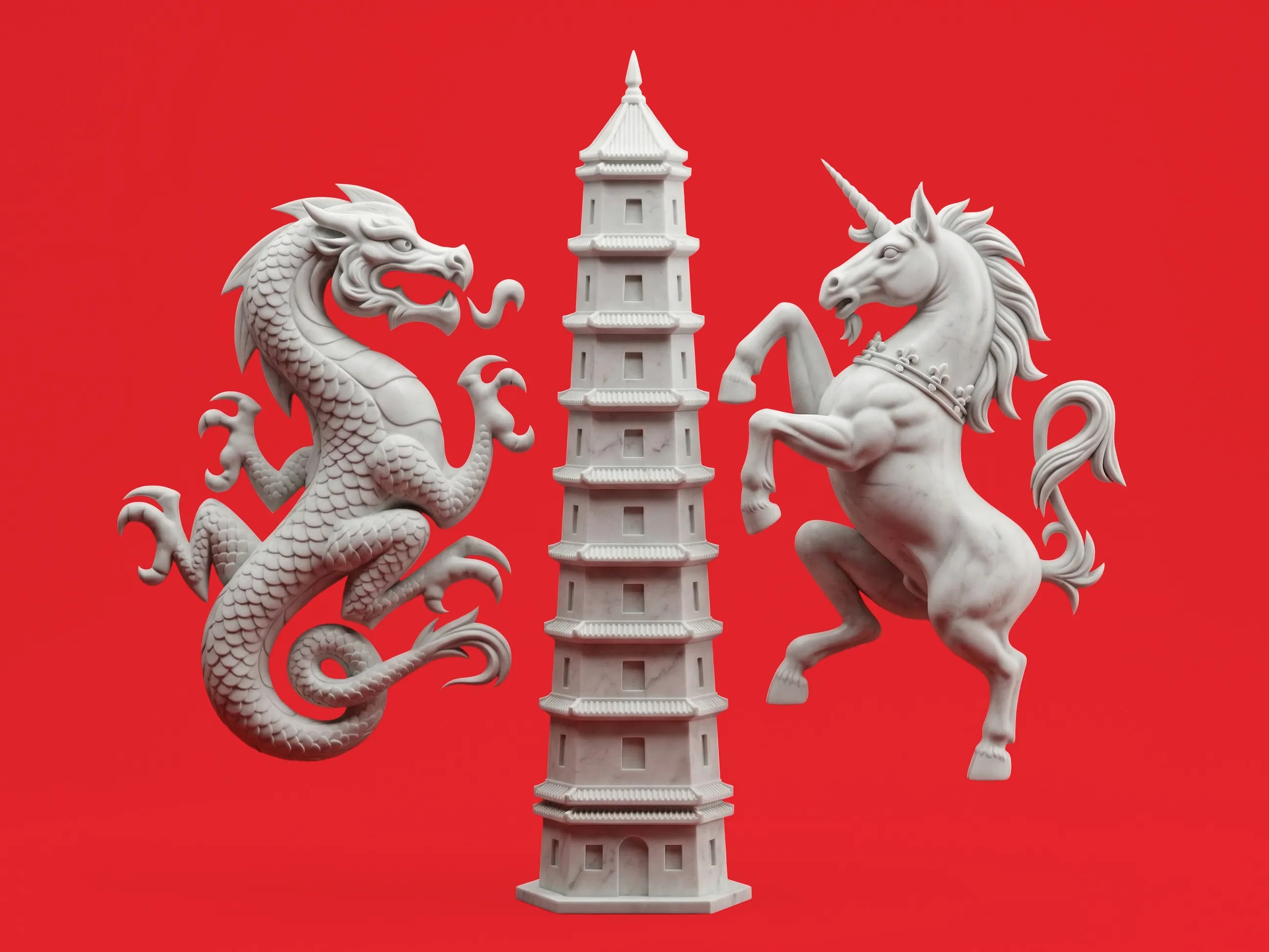
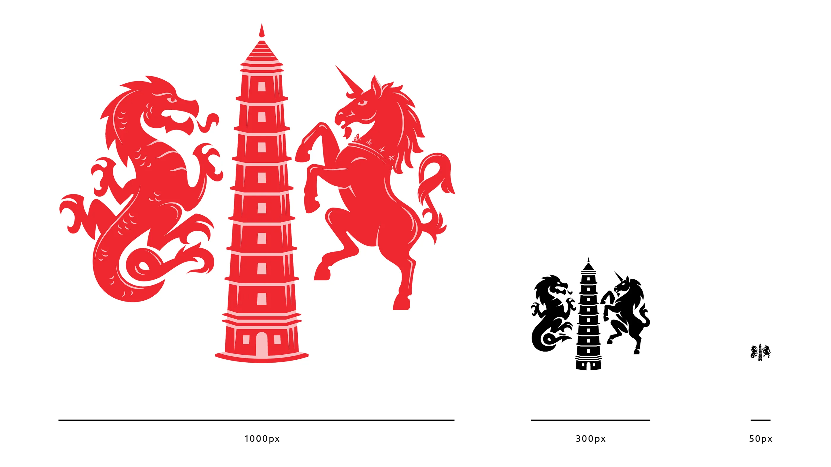
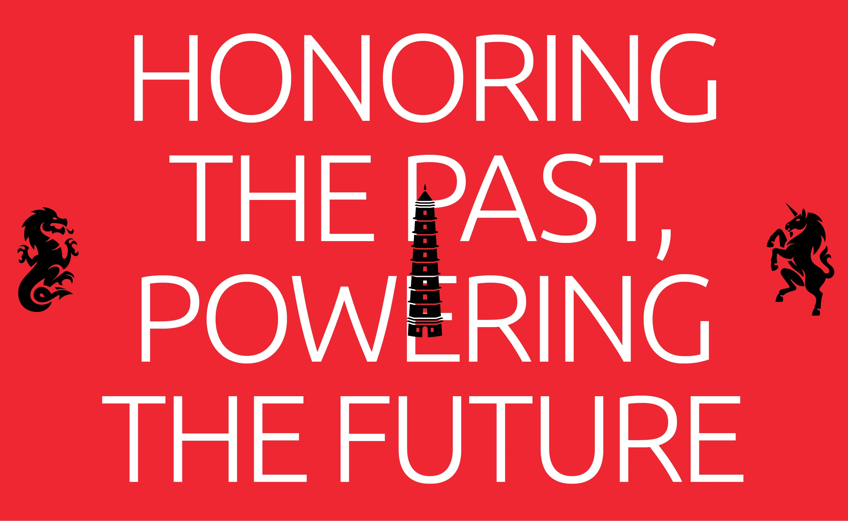
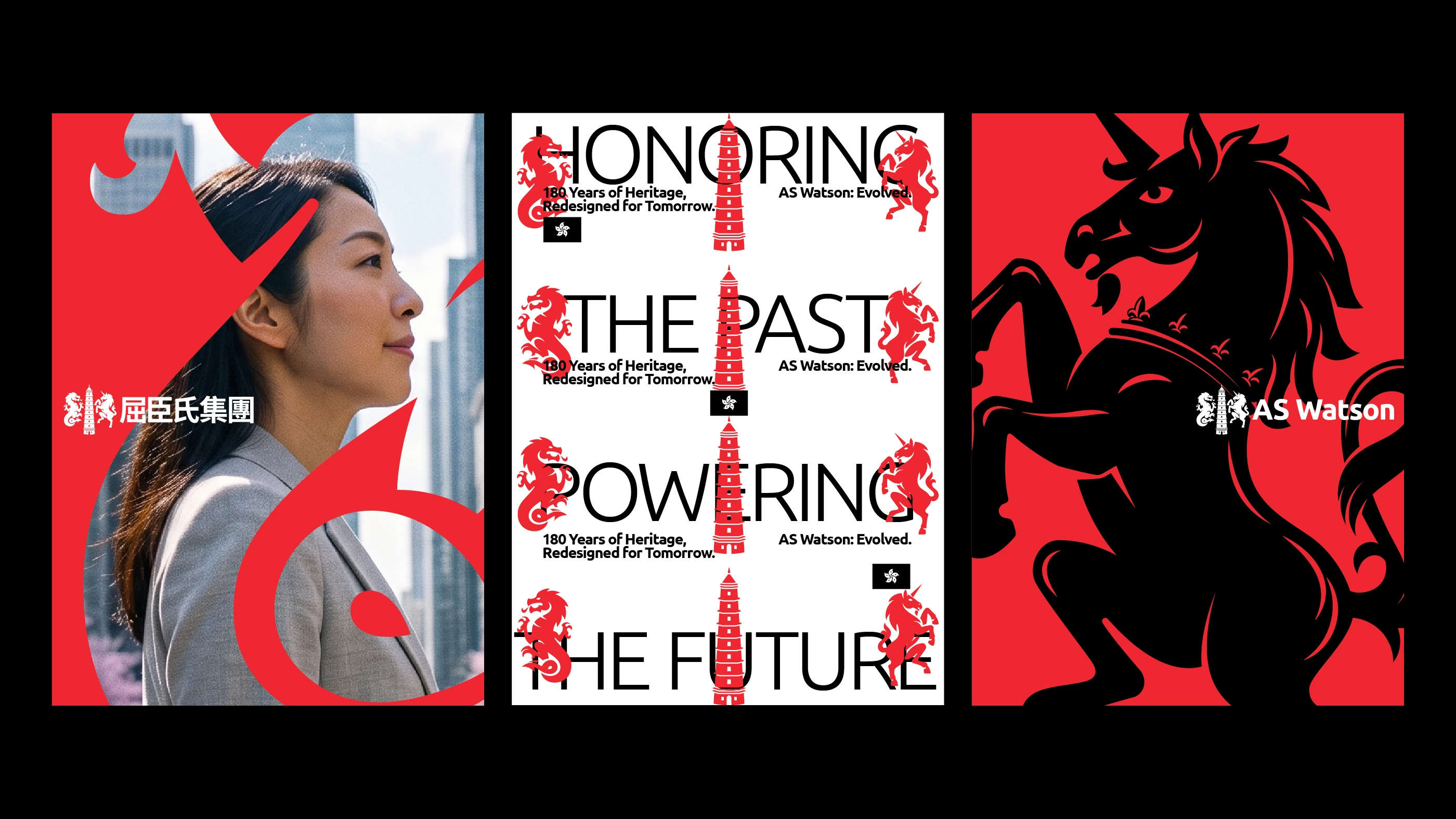
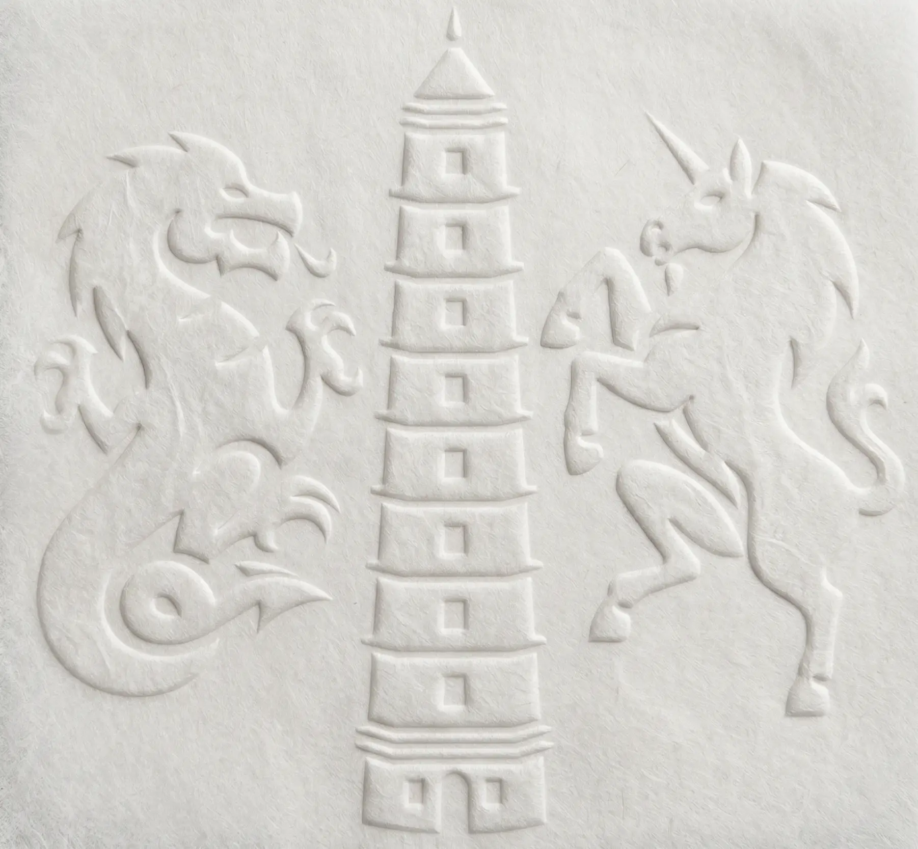
To modernise a heritage brand carrying 180 years of history, this project overhauled an iconic emblem that suffered from poor digital scalability and awkward roundel proportions. The original visual identity was hindered by inconsistent line work—notably between the mismatched dragon and unicorn—and a glaring historical inaccuracy in its eight-tier pagoda. By establishing a unified, bold design language, I redrew the heraldic animals to strip away visual noise while preserving their core integrity, and corrected the pagoda to nine tiers for symbolic completeness. The result is a sharp, balanced visual identity that honours its rich legacy while performing seamlessly across modern digital touchpoints.














Client
AS Watson
Agency
WHAM
Service