

Identity re-design for Ruckus Films
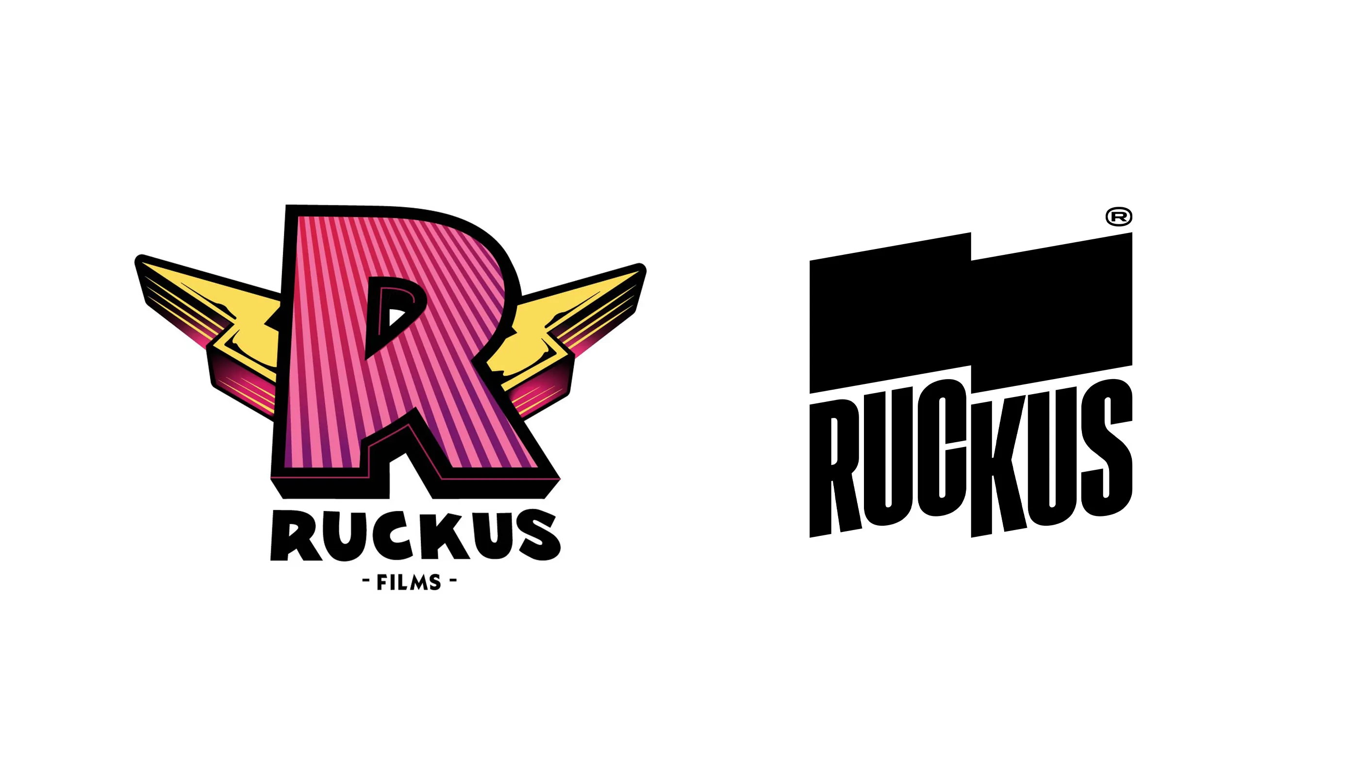
One of the redesign challenges came from Ruckus Films. They came with the classic “can you update the look but keep the concept and we like the colours too”.
Those who know Ruckus, know they’re all about witty, unconventional filmmaking with pure playful approach and loads of life.
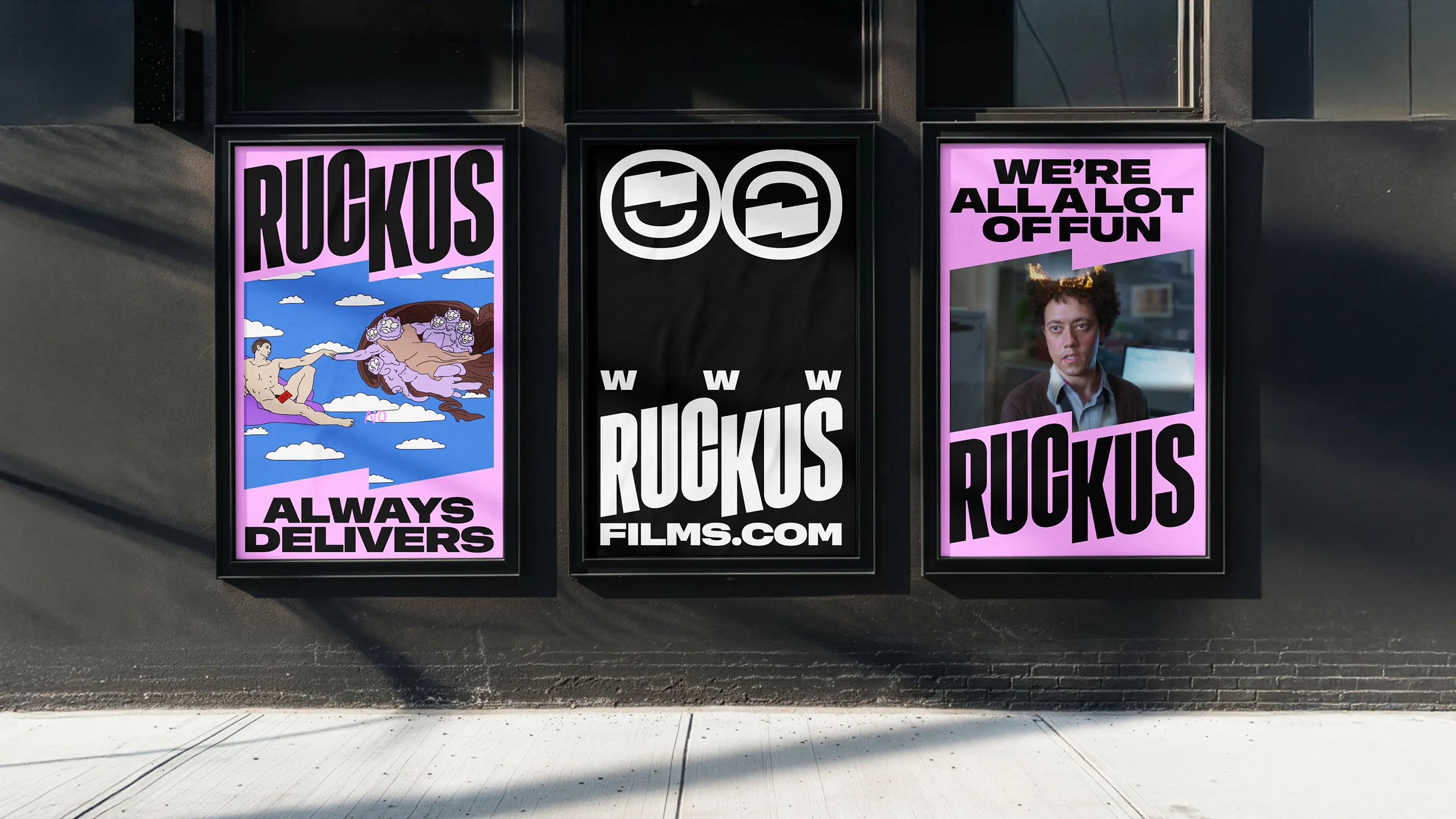
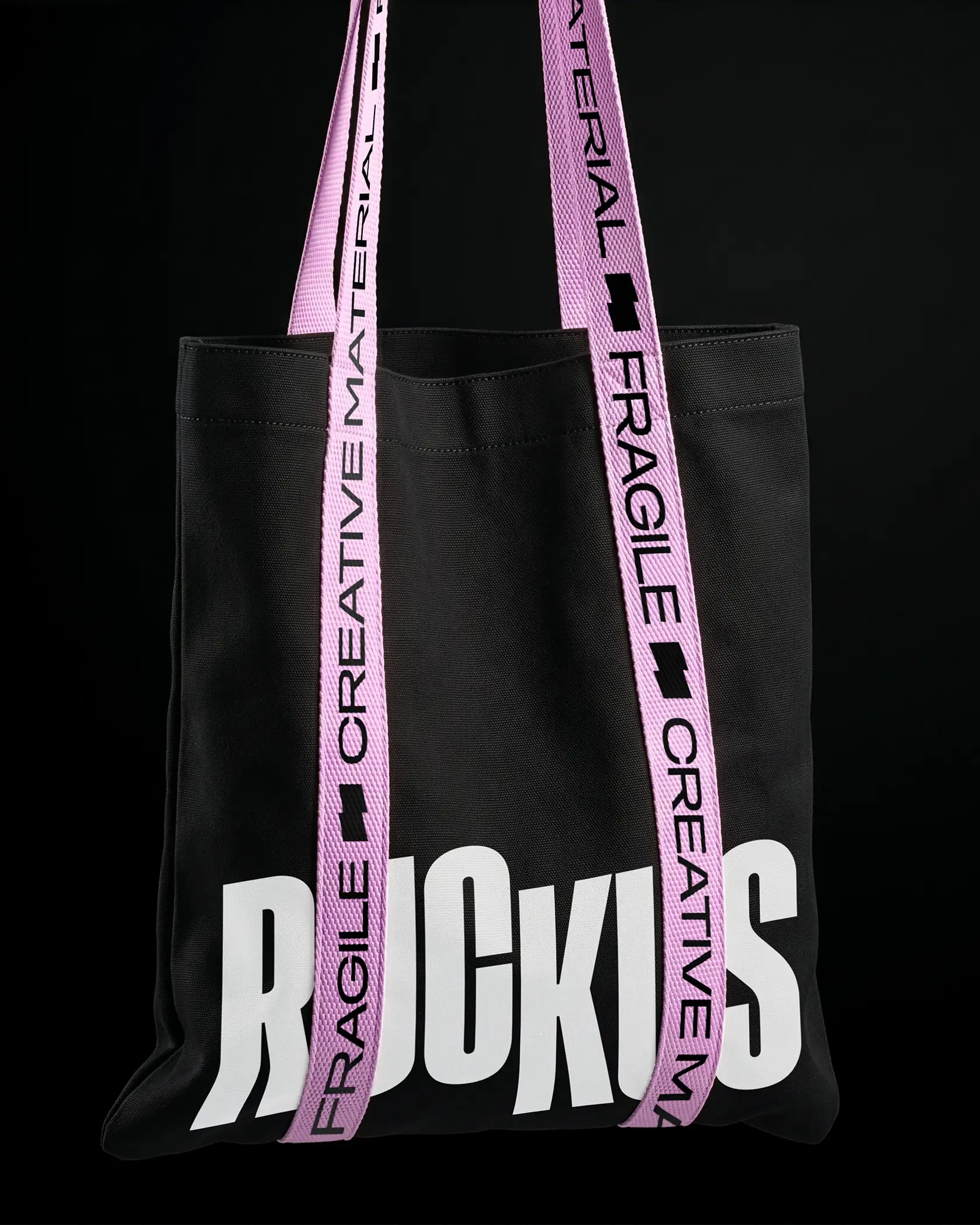
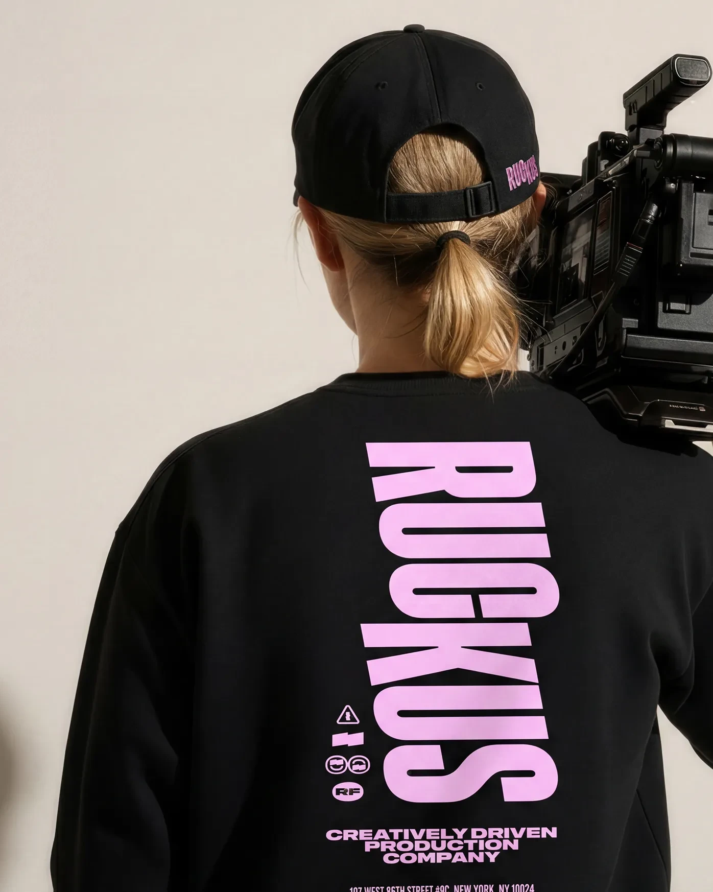
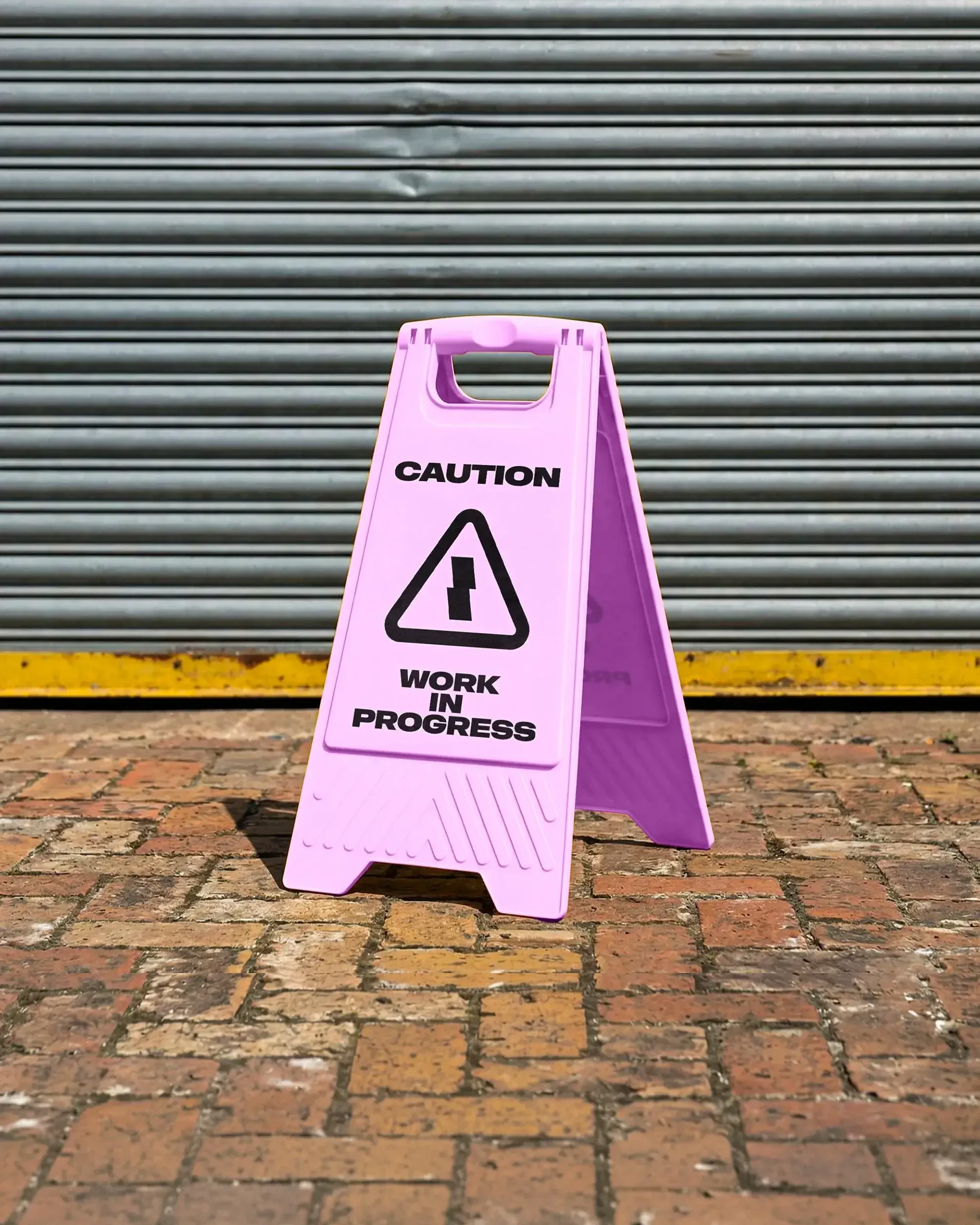
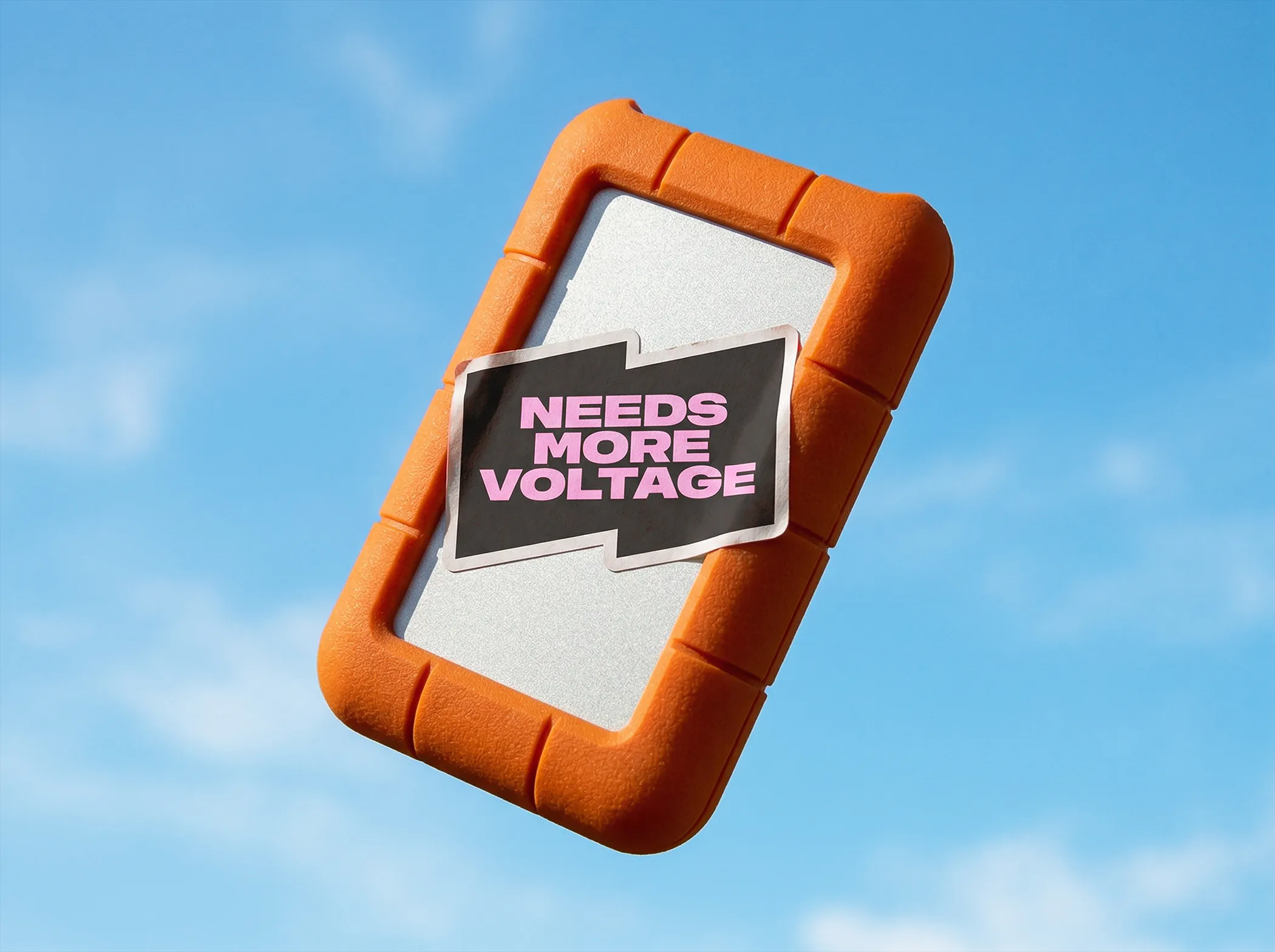
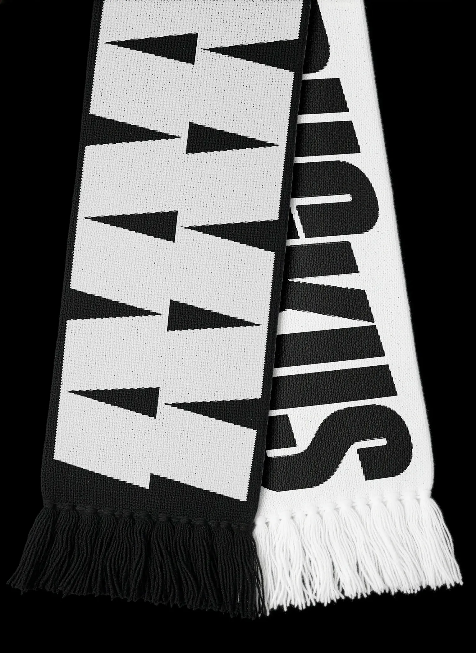
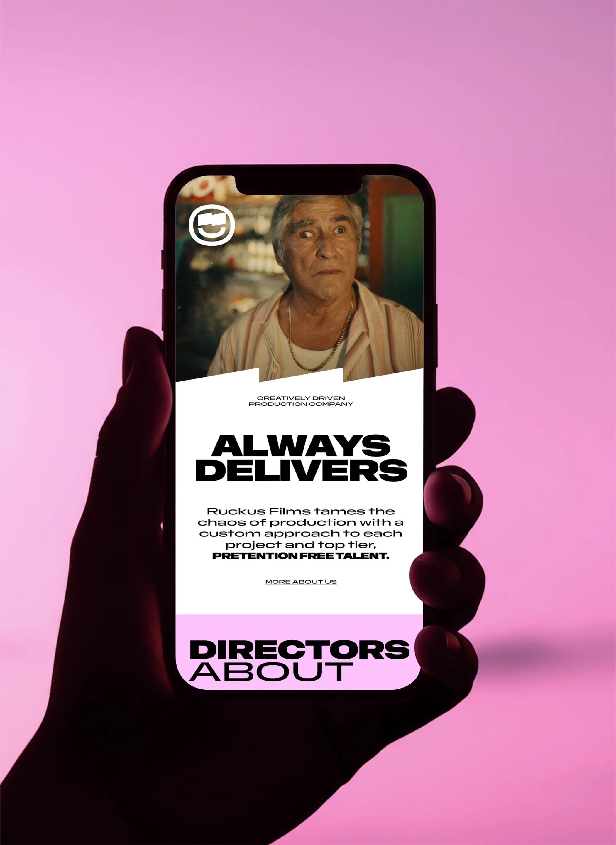
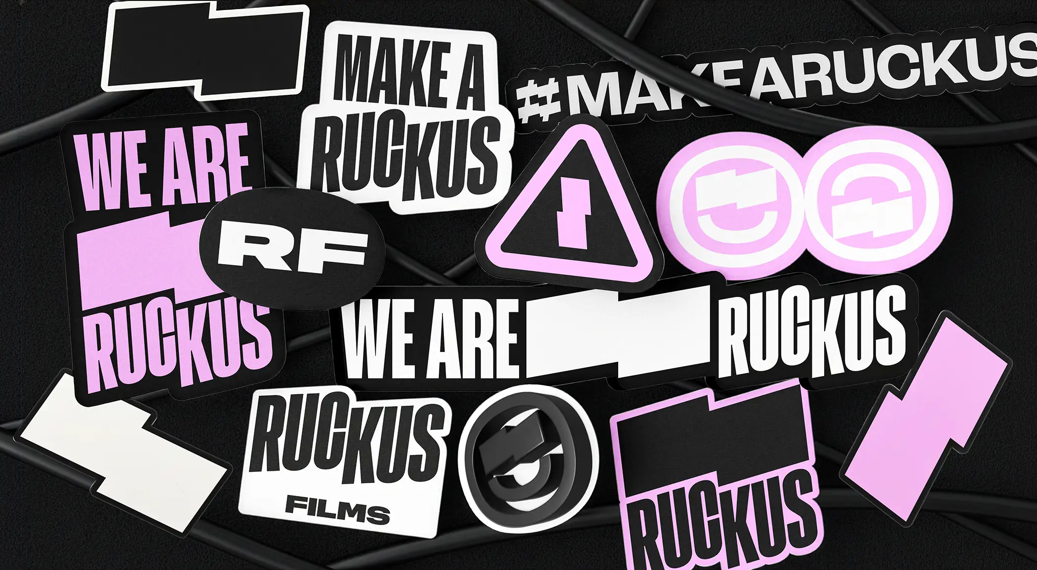
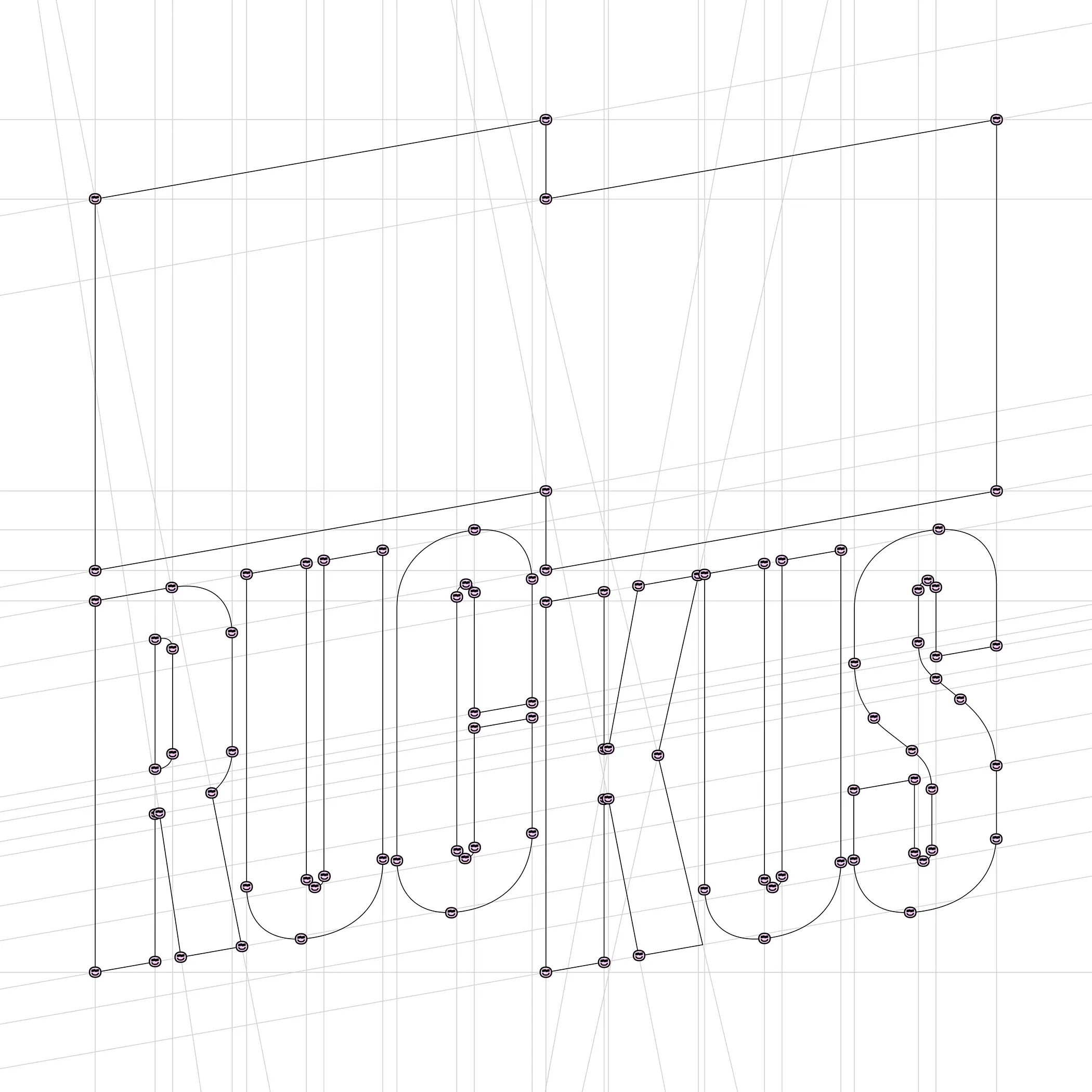
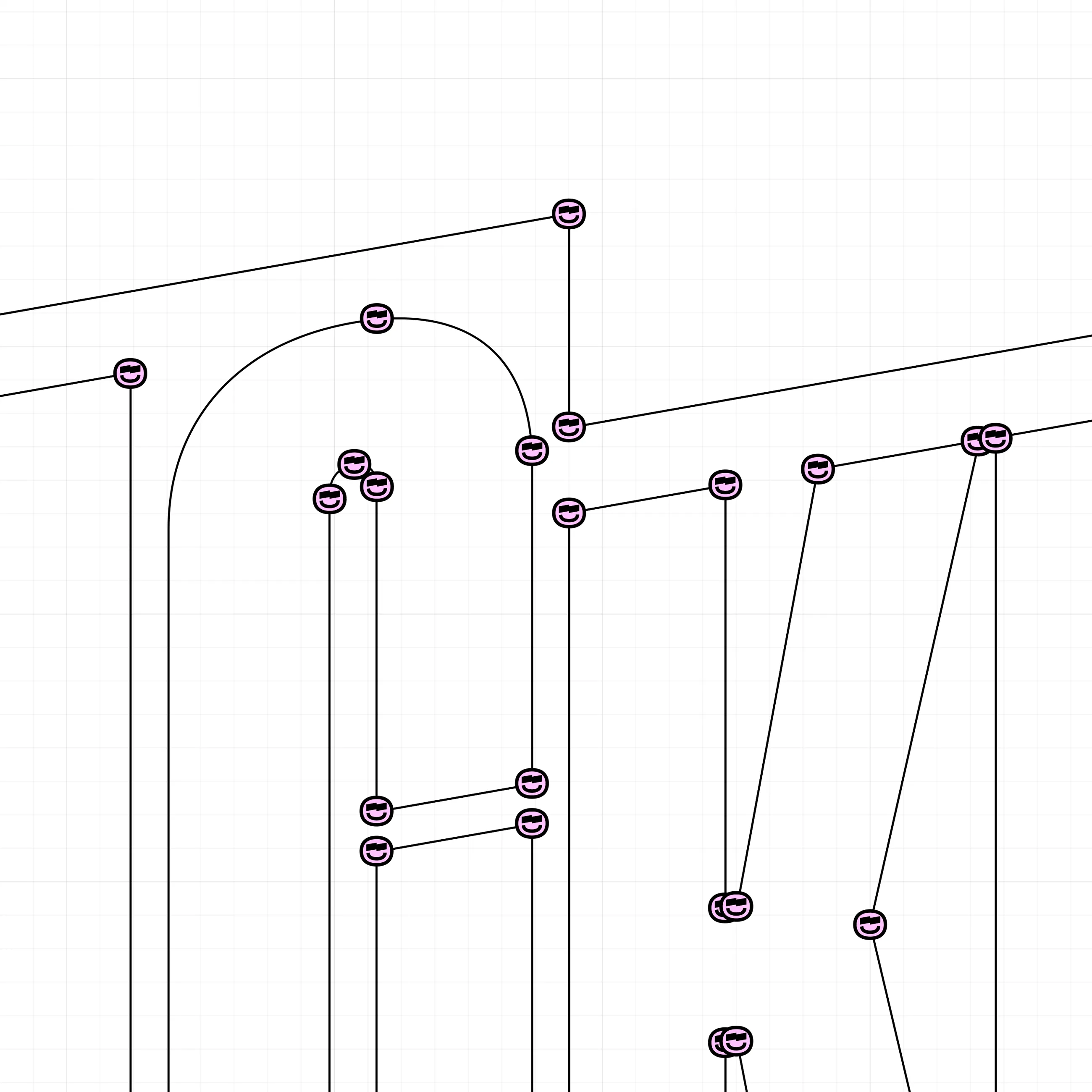
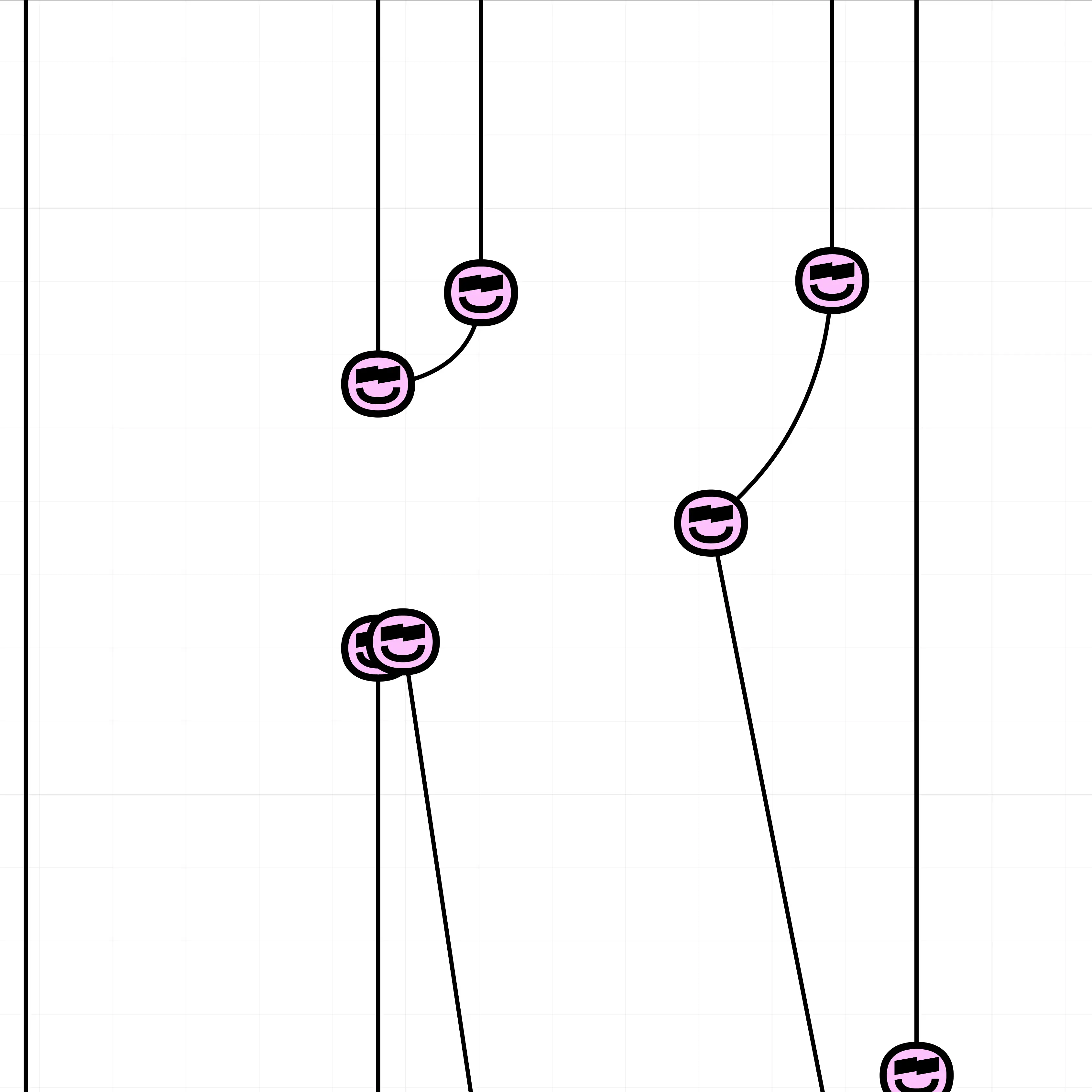
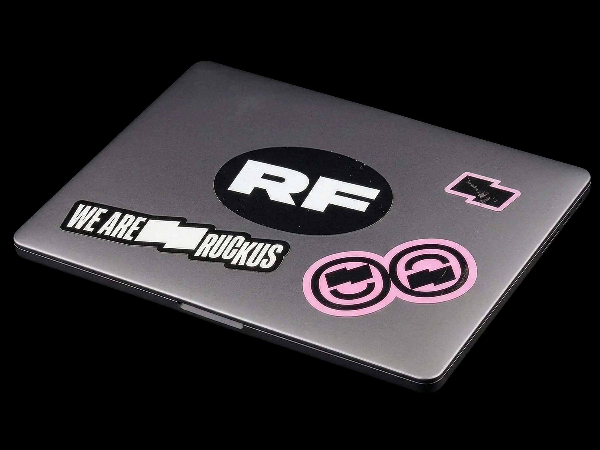
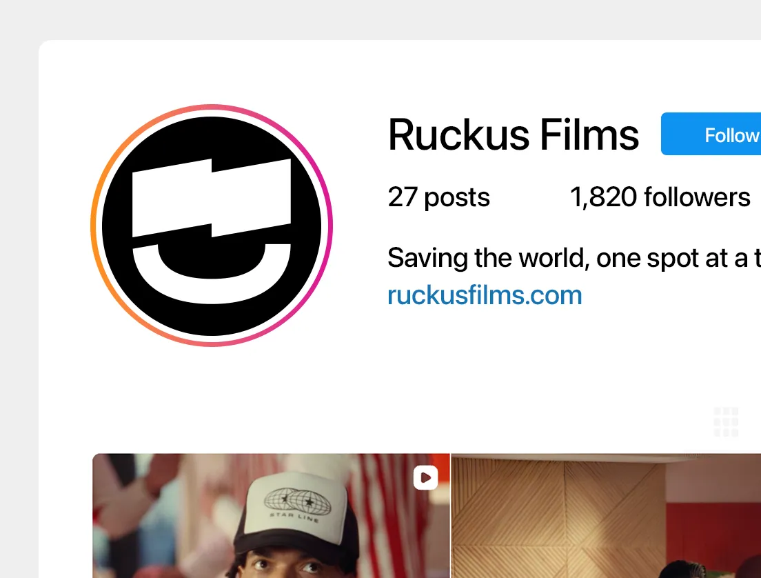
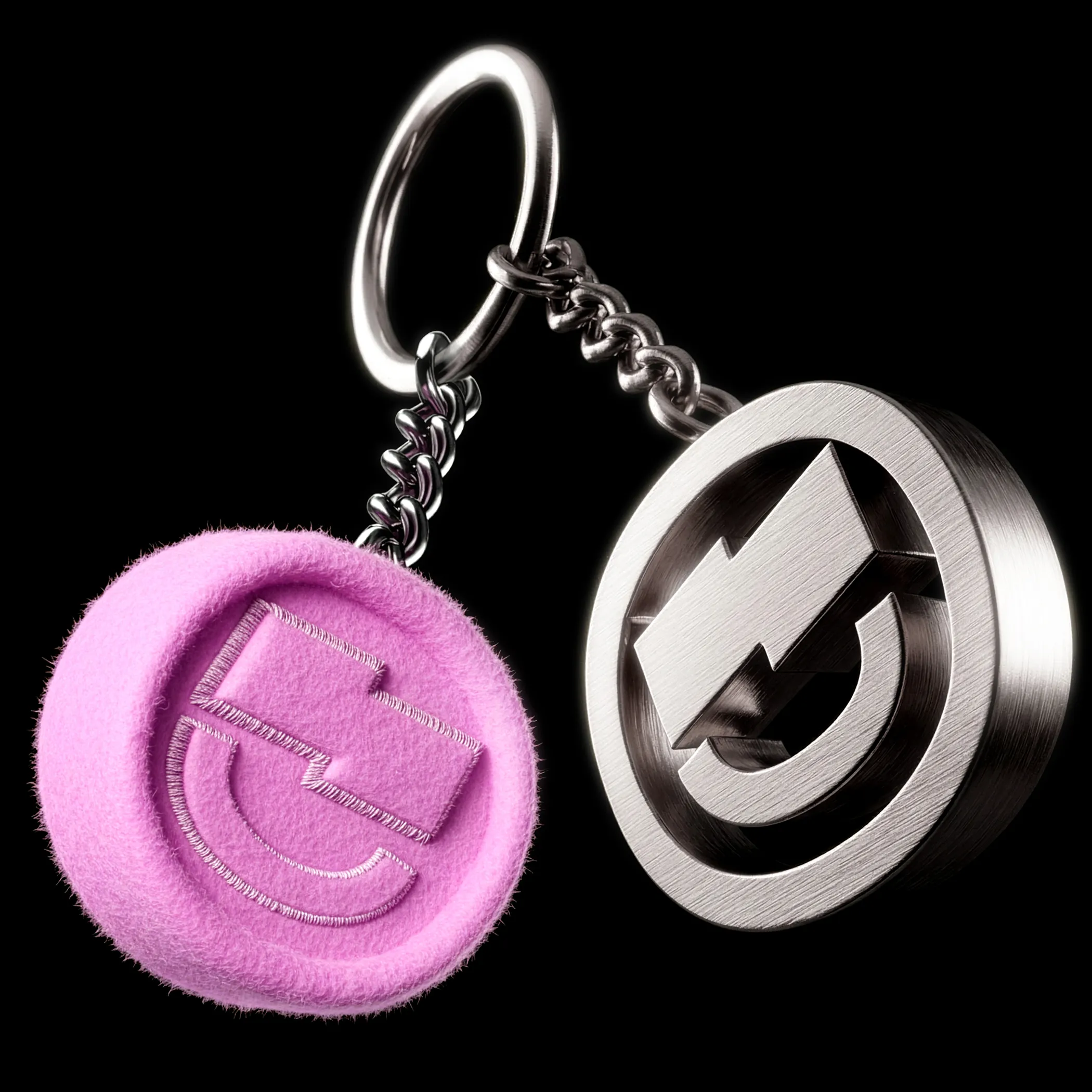
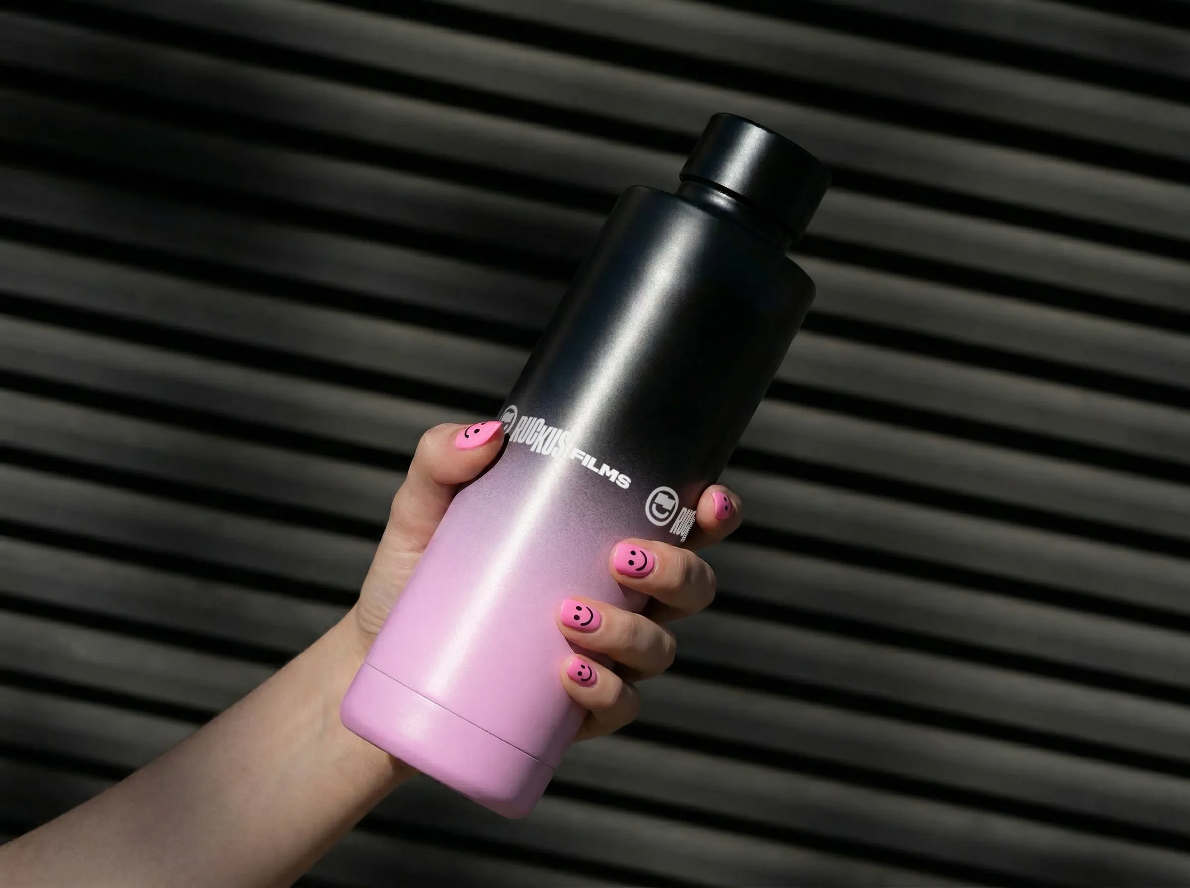
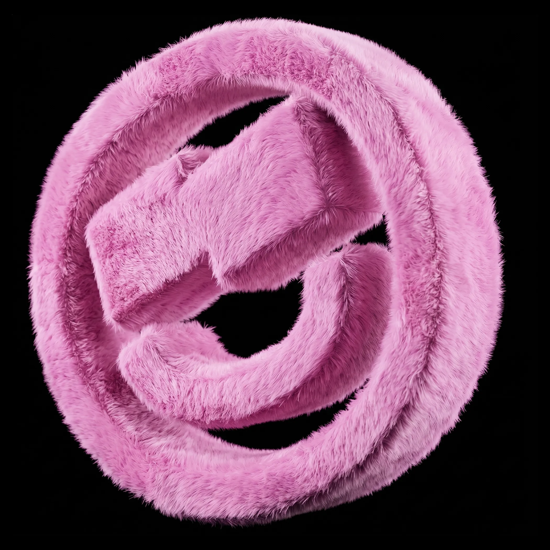
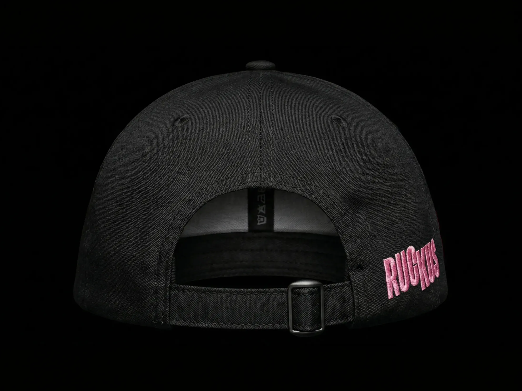
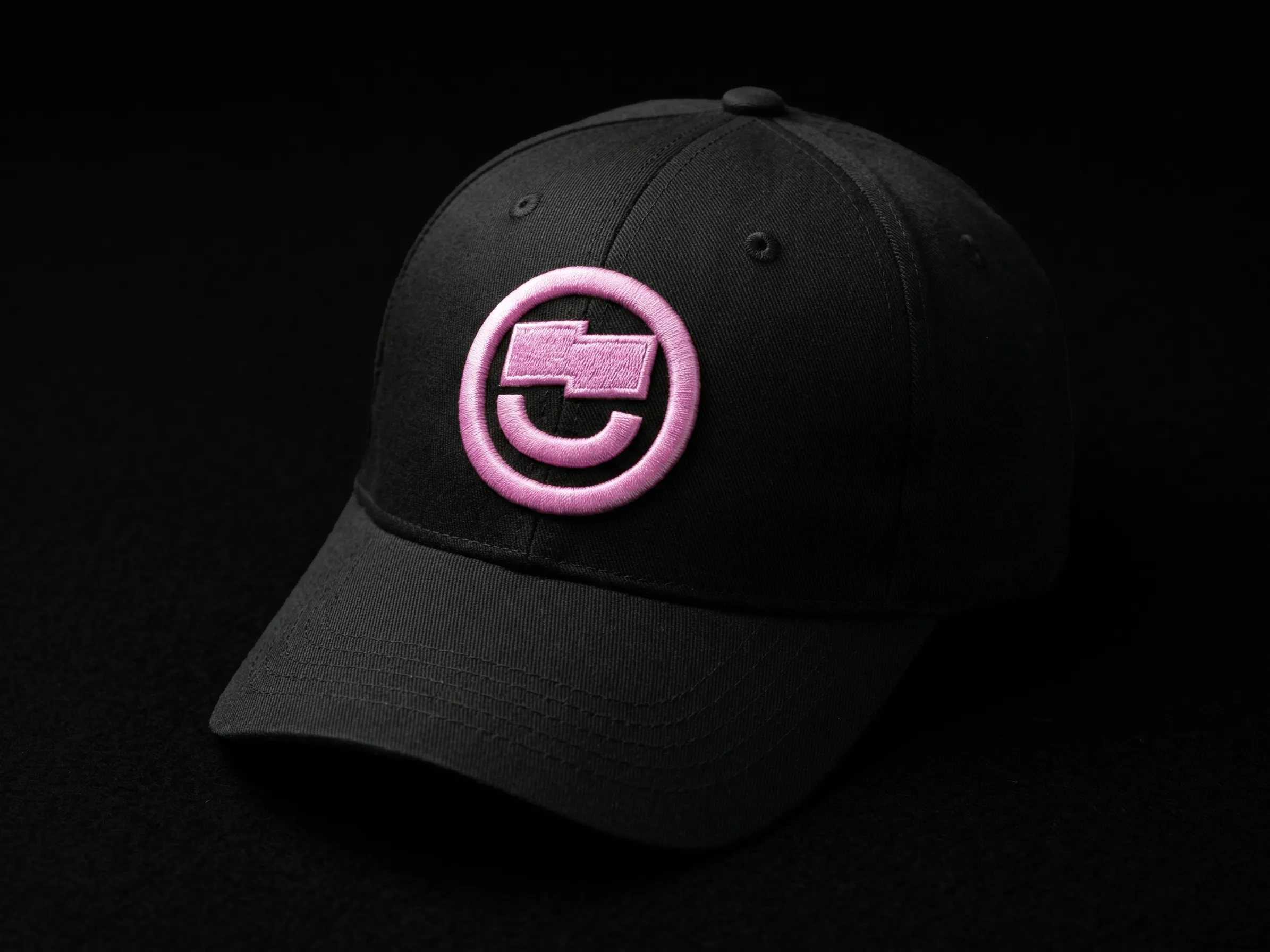
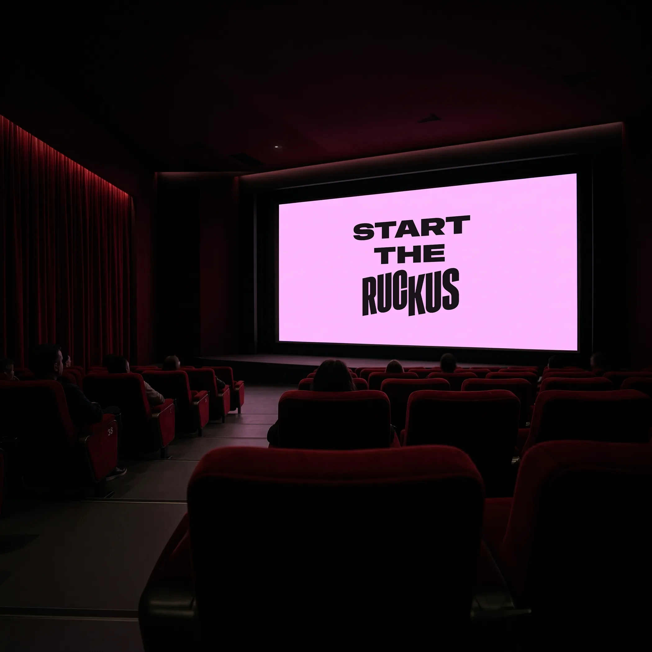
I offered to bin the literal bolt icon and breathe some life into it through the type instead. The concept came through in the split rectangles, mimicking the energy of the bolt to create a simplified, typography-first look that kept the ‘90s skater grit they were after.

Client
Ruckus Films
Service