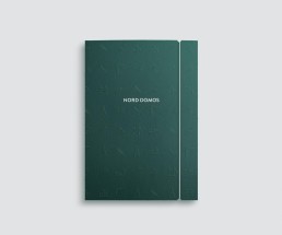
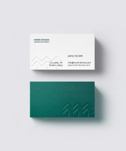
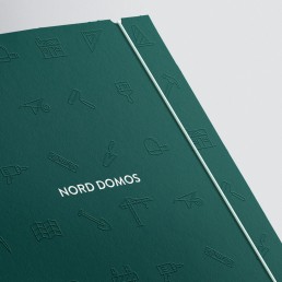
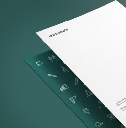
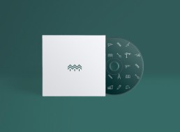
Identity for the construction company Nord Domos
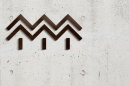
The word Nord stands for the “north”, which in respect of housing construction conveys solidity, reliability and protection from the cold. And with respect to foundations, the company has the ability to work in the difficult weather conditions of northern latitudes. The word Domos solves the problem of the name needing to belong within the construction industry in the broadest sense.
Warm house of the north
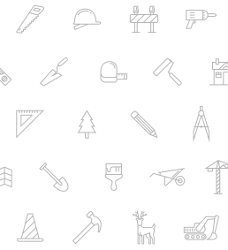
The task was to combine graphic elements with the logo reflecting the quality of the brand — professional design and high quality, warm housing. Within the different logo variations you can see houses, trees and knitted woollen patterns.

Warm design for warm houses.

Client
Nord Domos
Brand
Success Lab
Service
Branding, Logo
Featured
Chois Gallery