Typography out of a single shape: Part 2
I hear this a lot — beginner graphic designers struggling to create letterforms because “there are too many rules.” And to make it worse, type veterans often push this idea that letters need to follow strict forms and be instantly legible... 😱
I think most of those rules are kinda annoying. They can suck the fun right out of the process. For me, letters should come from play. In the early stages, forget the rules. It’s just you, the pen tool, and whatever weird idea wants to come out.
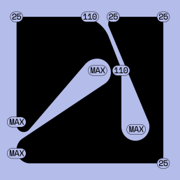
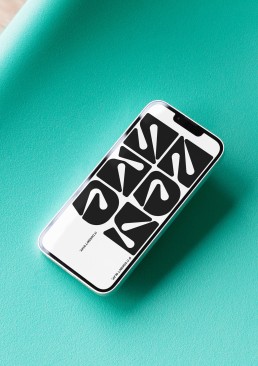
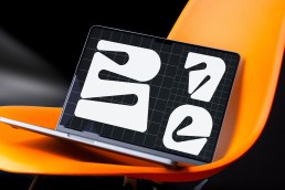
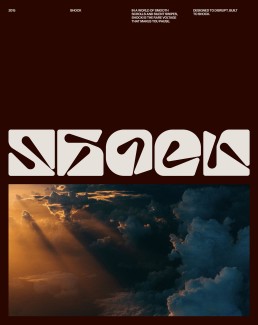
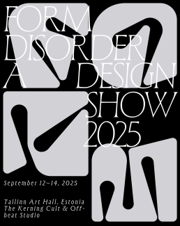
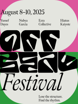
One great way to loosen up is through modular typography. A classic example? Armin Hofmann’s circular grid method — as a framework to explore letterforms.
My exercise here takes it a step further where you use a single shape to build as many letters and numbers as you can. It forces you to simplify, stay inside constraints, and still make something expressive.
Let me show you 🖖
1:05
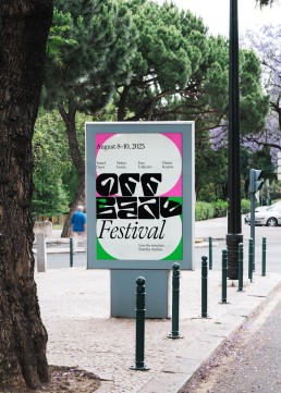
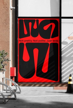
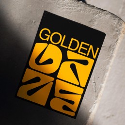
Additional visuals