How to make a unique poster using a cliché concept: A step-by-step guide
They say design should always be original. I call it nonsense. I believe it should be unique. Let me walk you through creating a visually unique poster, all while using a cliché concept.
1. Brainstorm. Just pour out your ideas onto paper, even the most mundane ones. Don’t overthink it — just get them out there.
2. Sketch. Pick one idea and sketch it out in more detail. Yes, even the silly or unattractive ones. Go ahead, sketch it!
3. Collect references. This could be from your visit to the art gallery, a shop window, online finds, or a piece of street art — anything that caught your eye.
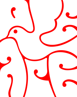
4. Define the flow. This is where you showcase your vision, using the references you’ve gathered in a fresh way.
5. Make the typography "ownable". Play with it, stretch it, reshape it — mould it into something that feels uniquely "it".
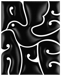
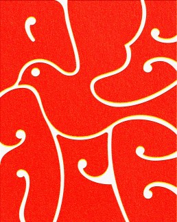
6. Choose a treatment. This is the cherry on top. Refine your design’s style with colour, texture, volume, and so on.
2:53
Additional visuals


