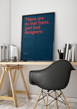
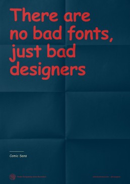
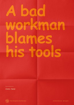
Comic Sans tribute posters for shitty designers
What pisses me off most is when a designer criticises the work of another without fully understanding what the other one had to go through to achieve the final result. One such example is the criticism levelled at one of the most wonderful and ingenious typefaces — Comic Sans — designed by Vincent Connare.
I made two posters with phrases written in Comic Sans, directed at critics of this particular typeface. The purpose of these posters was to draw attention to the true purpose behind the creation of Comic Sans and to remind people that their own incompetence in using this tool comes into play. These posters are perfect for the walls of design studios, full of lots of grumbling, snobby designers.
Project
Personal
Outcome
Lettering, Print


