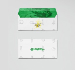
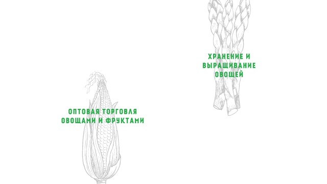
Agro-factory Naturovo is the largest trading production and logistics company in the Kaliningrad region. The main activities of the company include: wholesale trade, storage and cultivation, deep processing, packing and delivery.

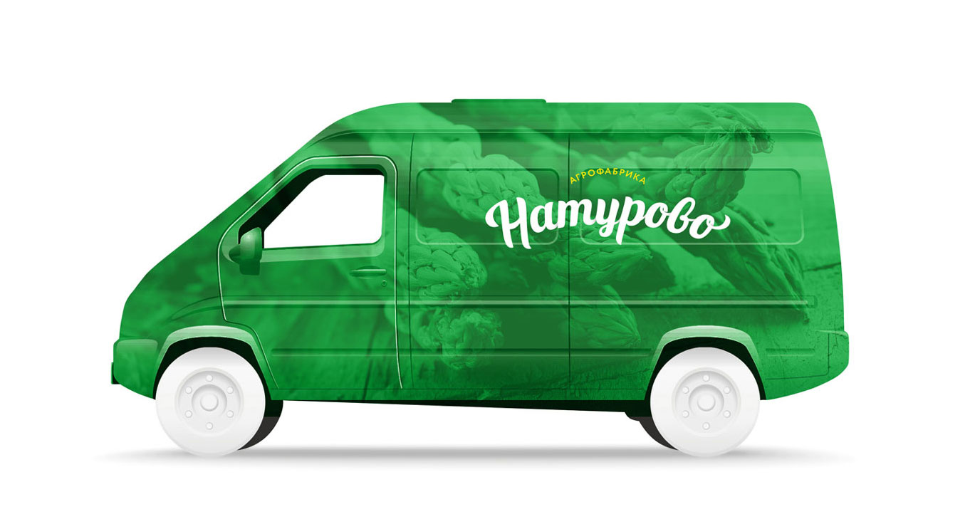
The developed positioning required for a radical change in the design of the old logo and the packaging. Keeping the essentials to highlight the company’s products on the shelves of retail chains, and emphasising the graphic design of naturalness and exceptional quality of products.

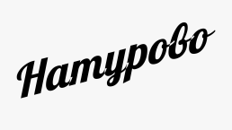
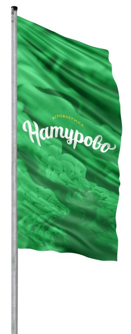
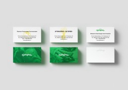
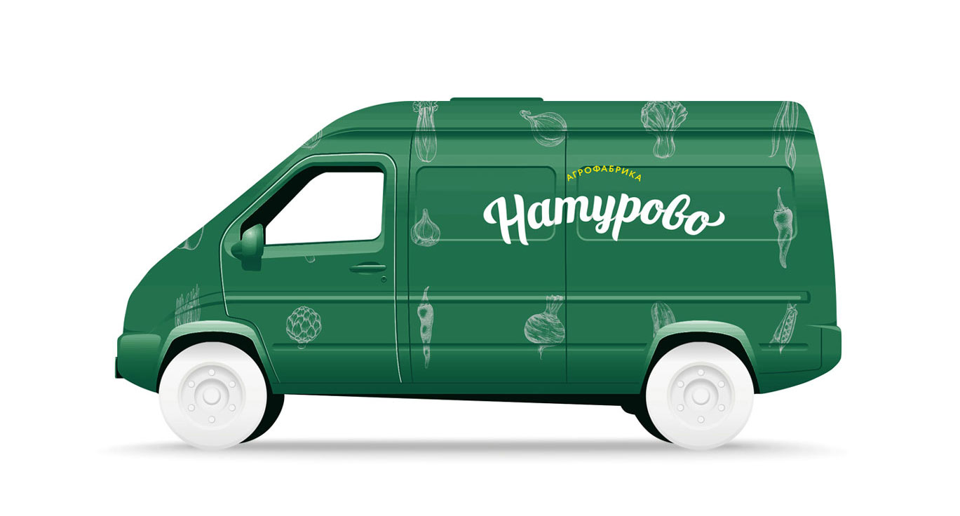
Four fundamental logo upgrades; (1) New logo uses the same font as before but with softened edges of the letters, thereby giving the logo the sense of a good predisposition. (2) The baseline of the main logo is also changed to the shape of an arch, which gives more stability and balance. (3) New logo has all letters connected and awkward gaps removed. (4) To make the whole logo feel complete, the final ‘o’ letter has a twirl as the first letter ‘N’.
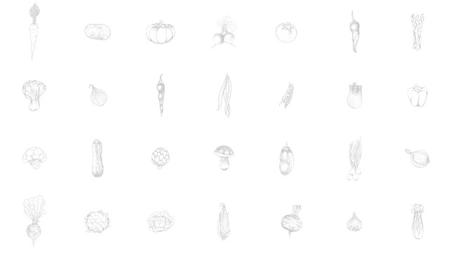
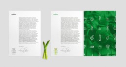
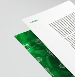
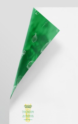
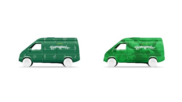
Icons are used as a supporting graphics to create patterns or stamps


Client
Naturovo
Agency
Success Lab
Service
Branding, Logo